Part 4 Exercise 5: A tattoo (artist research and my design process pt2)
PART 2
The use of a flower was the
inspiration for my mother days dedicated tattoo and card design. Before finally
deciding on a style, I had a look at some modern tattoo artists. The perfect
source to find them is Instagram as their pages show a whole range of their
work and theirs many to discover on just that app alone.
www.instagram.com. (n.d.). Login • Instagram. [online] Available at: https://www.instagram.com/p/CKmNrlKhA5K/ [Accessed 28 Aug. 2021].

www.instagram.com. (n.d.). Login • Instagram. [online] Available at: https://www.instagram.com/latoms/ [Accessed 28 Aug. 2021].

www.instagram.com. (n.d.). Login • Instagram. [online] Available at: https://www.instagram.com/bengrjtattoo/ [Accessed 28 Aug. 2021].

Along with these artists I found a lot of flowers dotted around my nans house that i thought were good for inspiration and reference, although most are coloured most were line work.


The flower designs and how they are positions were helpful in all the research for choosing my own arrangement and what flowers look nice together shape and colour wise.


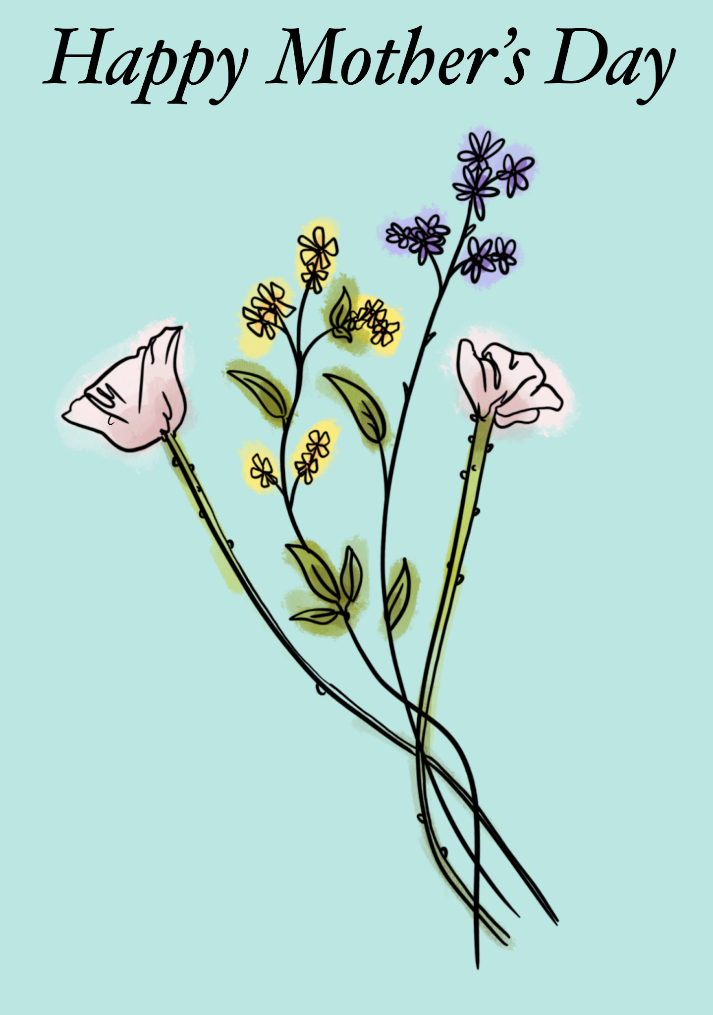
I think these flowers are quite light hearted and sweet. They remind me of summer or spring, I often see such flowers on mothers day and mum type gifts as most mums are known to like flowers. The tattoo designs roses are quite popular and sunflowers. I started by first seeing how many flowers I wanted to use and the composition and such.
I first just picked random flowers and made them into line drawings witha fine liner, the first page was more precise and clean lines where as the second page I tried to make busier looking arrangements that were a bit more continious


The colours I did add were all on the Mother’s Day card, I felt it was appropriate to make a more attractive and eye-catching image. The colours I used for the first design were pastel themed and light, between these two I made one, so the colours stayed in the lines this kind of relates to the line drawing of the tattoo being clean and neat. The colours also have a bit of tonal value, I created subtle shadows, giving the flowers a bit of depth. The other version I let the colours fall out the lines, I think it makes the card feel more personalised. It kind of reminds you of a child making a card for there mum and not being able to stay in the lines. It produces a sort of sentimental feel with the minimalistic design accompanying this ‘out of the lines’ element.

My second design was a sunflower, again a popular flower choice for a tattoo I kept it no colour and instead I added dots and shading so that to be a bit more realistic. I think the ends of the petals and the leaves have a bit more personality because the flower isn’t just a flat boring line drawing it had shading and little details.


The sunflower design I liked how the colours went out the lines and this time it’s a lot more effective as the colours are vivid and I’ve added shadows and highlight to the flower. The yellow and green against the baby blue and clouds on the background is really comforting, it creates a sense of warmth like it would be in spring and summer. Both of these designs were done digitally using procreate, I first would put a grey sketch of the drawing and then create a new layer an perfect it with black lines. I then duplicated the black lined layer and the bottom layer is where I put the colour.
Finally the text on the cards I picked according to how the colours and background looked. For the bunch of flowers design I thought an itallic font suited it as it was more of an elegant and fit the minimalistic tones of the card. The sunflower card is a bit less serious and a little more playful relating to the childlike colouring outside the lines and the brighter colours.


.png)
Comments
Post a Comment