Form and Function Part 2: Ex 3 Book designers part 2
Using a mixture of library and online resaources I researched some book designers and some of there book cover designs, comparing and reflecting on them too.
Peter Mendelsund Kafta collection is quite minimalistic, the colours are block. The designs themselves are expressive but simple.
Mendelsund ^Are they both conforming to genre expectations, or are they challenging them in some way?
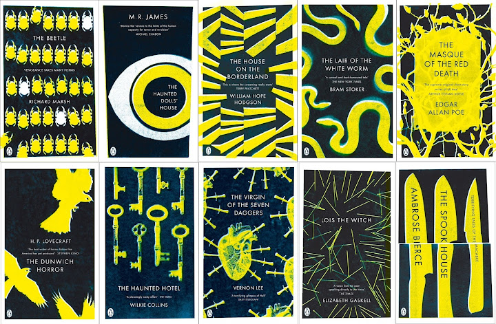
Coralie Bickford Smiths gothic series for penguin is conceptual imagery and design but there is also a lot of expressive placement of patterns. The reflects the gothic theme in her covers with her choice of imagery, crows, weapons, spiders, snakes, keys, key holes and eyes are all featured.
Bickford^The two use eyes throughout their covers and minimalistic designs and limited number of colours which makes their covers appear quite modern and the idea of using an eye and key/ key holes may make people feel watched or attract them to the ‘mystery’. However, Peters use of only eyes and the odd shapes or lines as well as a little use of key holes/ keys present more of a mystery as they don’t often connect with the title which has an unconventional typeface like cursive not bold clear lettering.
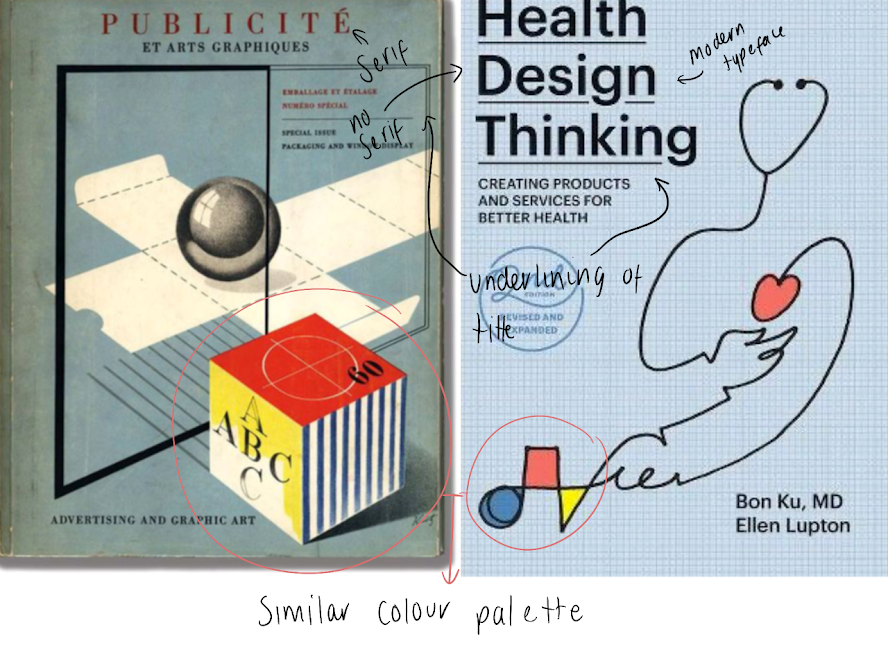
Do Jan Tschichold and Ellen Lupton’s cover designs have anything in common?
I put some designs side by side and actually found a lot of similarities like the colours, shapes used...
Both of their cover designs focus heavily on typography, both having their own styles using just text in different ways rather than relying on imagery alone. Lupton’s in comparison to Tschicholds feel more modern and colourful and there is hints of collaging for the background, Jans covers are very simple and traditional; straight to the point with the title and authors name.
3. Now, select three or more designers from the list that you are particularly
drawn to, either because you like their work or because you don’t
understand their approach, and research their design careers in more
depth. Think about how they’ve responded to very different design
challenges, whether they have an underlying conceptual and/or expressive
approach, and how their work has evolved over time. Continue to use your
75 Book Design 1: Creative Book Design
learning log to record their work visually, explore these covers through
drawing, and your responses in note format. See this as a quick fire activity
rather than a long essay.
I chose these three deisgners to explore further and it was really intresting to read about their methods and process when designing a book and how they started.
Julia Hastings
www.designindaba.com. (n.d.). Julia Hasting: The unusual book designer | Design Indaba. [online] Available at: https://www.designindaba.com/videos/interviews/julia-hasting-unusual-book-designer.
^ video interview
German Graphic designer. Started as a freelance designer and is not the creator director of Phaidon.
I like the unusual format, designs, overall unconventional approach.
Response to challenges:
After watching an interview (link above) She explains the process of seeing books as objects rather than this one size conventional book. The book is more of an exhibition of creativity which is the concept she introduced to the Phaidon company. The designs and features although look quite random always relates to the subject.
This book design is an example of how unique the books can be. It is described in the video as a floppy book but it has been vacuum packed and made solid like wood and hung up like an exhibition. Then when someone wants to read it the book returns to its naturally sloppy shape.
Irma Boom
Sayej, N. (2018). 8 Snippets of Design Wisdom from Book Designer Irma Boom. [online] PRINT Magazine. Available at: https://www.printmag.com/design-books/8-snippets-of-design-wisdom-from-book-designer-irma-boom/.
^ Article and guide
Dutch Graphic designer whose work is also very unconventional.
I like the weird collection of sizes, the books seem like a novelty but they still have all the content of a regular size book the only thing that different is the size.
Reading an online article/ interview (linked above) She mentions that the process of designing a book is to look at it like a sculpture; how thinking outside the PDF format box works well because using 3 dimensional features and physical technique it can’t be replaced or replicated digitally like most books are these days.
The Museum of Modern Art. (n.d.). Irma Boom. SHV Think Book 1996-1896. 1996 | MoMA. [online] Available at: https://www.moma.org/collection/works/110948?artist_id=33693&page=1&sov_referrer=artist.
^background of the book
I picked this design ‘SHV Think Book’ as it was and early commission and the brief was to ‘make somethings unusual’ which I think she did. Not only is the book small but it was “a 2,136-page document of the company’s history, presented in reverse chronological order”. It also had other features that tried to encourage readers to “journey through the book in a nonlinear fashion”.
Suzanne Dean
SPINE. (n.d.). SPINE-Interview with Suzanne Dean (Video). [online] Available at: https://spinemagazine.co/articles/interview-suzanne-dean [Accessed 12 Feb. 2023].
^ video interview
English Graphic designer who started out designing food packaging and brochure before joining Penguin then Macmillan and now who is the creative director of Vintage Books.
What I like is her designs always seem to capture the books atmosphere, the imagery and patterns and colours set the tone for each genre and its always different.
Response to challenges:
I watched an interview about the work she creates, and she takes the interviewer through the process of planning and how she gets to an idea such as a lot of research, mood boards and experimenting with the formats in a way that differs from regular conventional books and their designs.
I picked this book because I like the use of the acetate dust jacket having all the white text and patterns on. It’s a great idea because when it is shut on the black book cover the text is readable and if that sheet is taken off a subtle pattern and a big C remains on the actual book.
4. Finally, identify at least three different book designers you find visually
engaging. To do this you might want to visit a library, bookshop, or browse
online. Identify who designed these covers and find out more about them.
Try to work out why you are drawn to them. Is it to do with genre or their
approach to design? What is it about the design that captures you? What
sort of imagery, if any, is used on the cover? How does the text relate to
the image? What atmosphere or style does the cover evoke? Summarise
your thinking in your learning log - focusing on the kinds of book covers
you are drawn to and why - and continue to document what these covers
look like.
Three more designers whose work I have found visually engaging are:
Jason Booher
Interview and podcast > https://slate.com/culture/2021/09/rodrigo-corral-designing-book-covers.html
Jason Booher was late into design, studied at Princeton for a literature degree in order to be a teacher but realised it want for him. Worked as a person chef and then whilst writing a book and creating a portfolio he landed a job at Penguin as a graphic designer. I found and interview about his design process and such and it was interesting. I have put a few quotes about his design process…
“These days I tend to solve problems using formal-conceptual approaches. What I mean is that I don’t really try to come up with an image that I think will conceptually work on a cover. Instead, drawing from something in the book, I’ll consider a set of constraints, or a material, or a world of cultural ephemera, etc. from which I can start creating form.”
“Another way of thinking about this question of formal power or freshness is not to decorate. Adding extra elements to make a design feel like something is a sign that it wasn’t a strong enough design to begin with”.
What drew you to their work?
• Use of text in creative ways, all different typefaces depending on the theme
• Bright colours and pattern/linework integrated with text.
• Textured cover designers
• 3d features
• Modern and bold designs
What imagery is on the cover?
Cover for: The Art of Immersion
• Imagery that looks a bit like an illusion (immersive like the title suggests)
• Silhouette of a head with lines surrounded in the same shape small writing in the centre and around the edge as to not take up too much focus.
• Red writing breaks up the design.
What does the atmosphere and style evoke?
• Modernism
• Intriguing, curiosity
• Satisfying designs to look at
• Photography or pictures with 3d concepts as a 2d design.
other examples
Janet Hansen
I also found an article/interview about her design career journey. https://www.itsnicethat.com/articles/janet-hansen-graphic-design-040117
Reading the about page on Janet’s website I learnt she “is an art director at Alfred A. Knopf (a division of book publisher Penguin Random House) and a multidisciplinary graphic designer working with additional clients such as New Directions, Kenyon Review, A Public Space, and Plan Architecture. She also teaches designing with type at the School of Visual Arts”.
Studied at school of visual design and narrowed it down to design (book cover design). This began when her book designing husband who works for penguin giving her a freelance project.
Janet responding to a brief “I try to find common themes; I write them down on a grid sheet and pin it up next to me while I work. I research art and these themes for inspiration. Then I try to execute them in a way that is hopefully both unexpected and true to the book.”
What drew you to their work?
· Clean and modern designs
· Some hyperrealisms digitally rendered.
· Illusions, patterns, pop art styles
· Text is part for the design not just a separate element.
· Different art styles
What imagery is on the cover?
The cover: All we saw (poem book)
· Symbolism relating to book theme.
· Speckled hand looks like a galaxy with stars.
· Small white strip at the bottom for test
· Hand is the main image no colours but black, white and grey.
What does the atmosphere and style evoke?
· Calm
· Gentle and pleasant
· Modern
· Flowing and fresh
Other examples
Rodrigo Corral
Interview and podcast > https://slate.com/culture/2021/09/rodrigo-corral-designing-book-covers.html
Rodrigo Corral is a New Yorker graphic designer and creative director has always been into drawing. studied at the school of visual arts. Some popular books he has designed: James Frey’s A million little pieces, John Green’s the fault in out stars and Junot Díaz’s The Brief Wondrous Life of Oscar Wao. I listened to a podcast of a conversation with Rodrigo all about book designing.
What drew you to their work?
• The photography used.
• Minimalistic and light
• Magazine like
• Textured and unconventional designs
• 3D rendered images.
What imagery is on the cover?
The cover: series -OUTLINE, TRANSIT, KUDOS
• Travel images different perspectives, shell, insects in glass, sand, plane window
• Showcasing of photos with vintage hue
• Simple black text
• Can imagine it being a magazine or art issue.
What does the atmosphere and style evoke?
• Fashionable
• Nostalgic
• Vintage
• Calm/ cool
• Delicate
- Chromatic Aberration
Other examples


.png)
.png)
.png)
.png)


.png)
Comments
Post a Comment