Part 5 Exercise 7:Educational Strip


What are the most common problems that an adolescent like you is facing?
The common teenage problems that teenagers face today are usually related to:
- Self-Esteem and Body Image.
- Stress.
- Bullying.
- Depression.
- Cyber Addiction.
- Drinking and Smoking.
- Teen Pregnancy.
- Underage Sex.
BBC Bitesize. (n.d.). Hormones and puberty - Coordination and control - the endocrine system - OCR Gateway - GCSE Combined Science Revision - OCR Gateway. [online] Available at: https://www.bbc.co.uk/bitesize/guides/zcymk2p/revision/4.
www.mvorganizing.org. (n.d.). What are the hormonal changes during puberty? – MVOrganizing. [online] Available at: https://www.mvorganizing.org/what-are-the-hormonal-changes-during-puberty/#What_emotional_changes_occur_at_puberty [Accessed 8 Nov. 2021].
main sources ^
The thumbnail sketches I transfered to digital, the effect of a cartoon in digital lloks more professional I think and cleaner then if I handsketched it. If the leaflet is to be done using a computer a digital drawing would fit better.
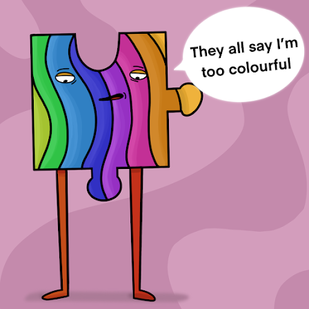
My inital thought was to focus on hormones and emotions and I created this 5 headed character each representing a emotion or action which would be relatable.However thinkign about a whole strip of five frames It was hard to tell a story and expand if all the variations of the character were already visable.

First this is a strip were these weird looking creatures are relatable struggles for teenagers, my goal was to give them humourous personalitites.


similarly to the idea of not fitting in using different shape rocks again with personalities makes the idea of being different not so isolating as eveyone is different.
In order to make them funny I was to really rely on the expressions and the speech bubbles so I tried out one of the ideas I found the most fun. The creatures


I think the text bubbles being funny quotes make it very readable, as well as it also making the readers think about the comments and then maybe makes a conversation about such things easier when it's backed up by silly and relatable scenarios.

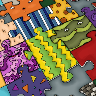
The next idea I decided to expand was the jigsaw pieces, It may not be as funny as the other but Its still light hearted and still sends a good message. The illustrations being friendly and colourful is a lot less serious and boring then if it were to just be text.
Working with 4 singular jigsaw pieces as characters in each square I drew 4 different shaped pieces and gave them different patterns and colours so I could add the text to suggest their differences.


For the last panel I had an idea that there would be a jigsaw almost complete full with other patterned and shaped pieces, the message is to let the teenagers reading it that its okay to be different, everyone fits in somewhere. below is from he intial colouring and then the final details where I made certain pieces stand out.

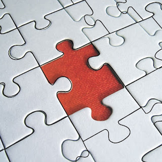
this was the process from getting the reference for the jigsaw, I made traced around some of the image but made some pieces bigger and smaller then others as that was the theme of my strip.


As well as the strip I created a front cover with stand alone illustrations of the characters all together as well as testing out some titles and text that would fit the cartoonish style. This writing is all freehand and I think it makes it a bit more personal then computerized text.


I think the title is very modern and it again reflects the idea of the title going mad like the body in this scenario. A little detail I added was that the tall character potruding up to the title resembling a cloud and squishing against its head. The extra bit of text would be jut an example if the same font were to be used. The bottom of the page seems empty but I can imagine some text being there to.


.png)
Comments
Post a Comment