Altered books Part 4: Ex 4 Collating and Binding
Reflect, evaluate and rework
Looking through the sequence I can see the different techniques, styles, colours and other things Iv'e mashed together. I didn't have any intentions of making a perfect same sized and style narrative so its all a bit spontaneous therefore makes it a bit more intruiging to look through.
Which pages are successful?
The pages I think are the most successful are:
1. This fisrt page is a bit unsual but it's a mixture of three animals within the poem the 'squeal fo a sparrow' 'like a dog' and the title ' tango with cows' drawn on beige paper This is a colured pencil hybrid. The backgorund colour is really satisfying, its brought the colours out lovely and the black is so bold. If it was just on plain white i dont htink it'd be as effective. the way I have merged the animals to is a good order the thickness of a cows body is perfect for the bottom of a bird head and the back being smaller connects to the dog behindreally well.
4. 'Tinned Mirth' I like the style I chose for this page. The ugly but joyful expressions of the faces sort of resemble the happy and sad theatre masks that often represent the emotions of acting which is fitting in this case. The faces are slightly distubing and a bit warped. The tin with the faces exploding out is like the consequences of the mirth being tinned. It visually clear in whats happening.
8. 'Perhaps we will drink a glass of wine to the health of the comets' This page was inspired by the Artist Tom Phillips who is known for reworking books enterily and producing completely new designs and context. I like the size of this page its petite but still powerful. It reflects the lines well, space and comets being a main focus. The blacked out page with just the poem words scattred like stars around the page stands out. I also think the images and word comet being a different paper helps with the visuals.
11. 'hornless and ironed!' This page is a digital illustration in my own cartoon style, the dumb and empty expression paired with goofy teeth is silly and lighehearted. I think it successful as it captures the essence of a cow, how they can be so big yet so nonchalent but still have a curiousity. It's a cute drawing which I feel follows the tone of the poem.
Which pages have not turned out as well as you had hoped?
There weren't to many that didn't turn out well but these are the ones I think are the least successful creatively.
3. 'spring' The first thing that comes to mind for spring is daffodils so it was an obvious choice for me. But while the painting is sweet I dont like how I wrote the word, itd prefer to let the colours and flower speak for itself. The scale aswell becasue I painted it straight on without drafting it it turned out a lot smaller than I planned. The paint also lacked a bit of substance in comparsion to the background it was all too flat so I added some fine liner to outline the shape.
6.' king of orange grooves' This is my least favourite page because I had a vision in my head of a bright orange in pastel wearing a crown that was on an angle. It started off well but the crown was as titled as I would gave like so it looked a bit too rigid. I tried to save it by adding some marks and scribbles for the background to liven it up but instead the colour palette failed me, its a bit too dark and its quite ugly in my opinion. Even the shape is unflattering again I was trying to save it but It didn't. I would have had another go but I thought they cant all be perfect. It's the unpredictability thats the fun part especially its a bit hard letting yourself not be such a perfectionist.
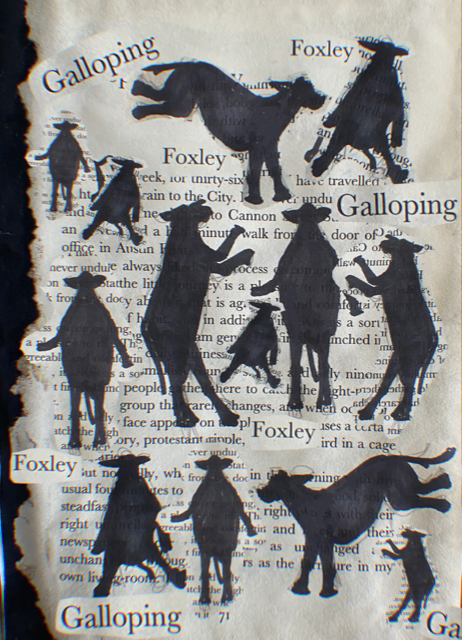
12. 'I want one - To dance one' Illustration wise I'm happy with the outcome but its more a printing issue. The printer isnt very good aswell as there isn't much ink left so the colours are lacking. The background is a bit too dark, the cows hooves blend in.
Are there any visual surprises, or happy accidents?
13. Its not too much of an accidnet rather than a coincedence that I found a page with the title 'Galloping foxely' which goes perfectly with the idea of cows dancing.
16. ' bovine jealousy' I was originally going to just cut a cow head shape out and paint it in yellow but becasue I put a bit too much paint on the page it was thick enough to create some facial details and it's ended in me actually molding out a cow head.
Select and collate
Evaluate the strengths and weaknesses in your work and then begin a process of
selecting up to 16 pages that work well together as a whole.
Strengths of the Narratives
- Mixture of styles
- Use of paper ephema
- Colours
- Use of mediums
- selection of images
Weaknesses of the Narrative
- Mix and match of scales and differences in the materials
- Messy with wet glue, running ink, tranferred pastel and charcoal
- inconsistent use of pages eg. some our double pages some are black pages next to singular design
- Abit confusing to interpret
Do these pages have images on each side of the page, or will the images appear on facing pages only?
The illustrations I have created and reworks and digital versions I decided to keep in chronological order because I like the flow. A problem that arised was some fo the pages qere printed landscape and some potrtait so It's made some of the pages poke out when to cover is shut. However I dont think it interupts any part of the narrative, if anything the first illustration being on show might intruige as right off the bat it looks like a bird with hooves.
Most pages have images on both sides besides 2 as one was a mistake and the other was the first illustration. On the landscape pages specifially the ones stuck to a portrait page there is an obvious blank space above an below the image which could be helped really, if i were to make them all face the same way there it would be difficult chopping or adding parts to make up for it.
Binding
Drawing on your understanding of bookbinding so far, bind your 16 pages into a
small book format. How will the pages be held together? Consider how the pages might be bound and experiment with solutions.
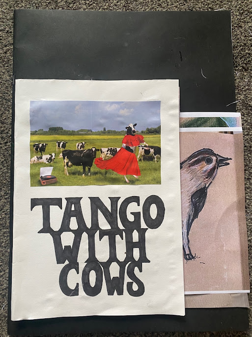
As far as binding I really wanted to try stitch the pages together maybe sticking to the spine but half way through the needle snapped and we had no more so instead I had to resort to perfect binding (Typically used for lesser page books, magazine and so on, using a strong thermal glue which keeps the pages together) with super glue which is really effective, even though some of the pages are not completely in line with eachother they're all glued to the cover securely. Becasue the format was in A4 I wanted really to find a big cover piece to conceal the pages but all I had was an A3 piece of card. I suppose because the main purpose was to bind the pages this factor isnt too important becasue securing the pages was successful.
Will you create a cover?
Yes, I feel a cover ties the narrative together. It's also an anchor for the pages inside with a sturdier piece of card being the foundation and gives the audience that first impression. Using a picture could also give some context.
On the cover I wrote out the title of the poem 'Tango with Cows' in bold black writing with slight serifs, I freehanded the letters so this typeface isnt really a genuine type its a miss match of a few serif font qualities.
Will the pages be stitched, sewn, glued, stapled or will you use another inventive
approach?
Using glue for the main binding I also used staples to connect two back to back pages so I could break it up rather than having to try fit every page in the stapler to connect them all. I wish I would have had proper book sewing thread and needle as you can see the holes. It would have turned out a lot more professional looking. The thought of using a coloured stitching like red or a prominant colour in the sequence could have made this mini book more powerful.
As for included pages some of the reworked I didnt choose to use as I liked the original better. But I did swap out this picture for the reworked.


.png)
Comments
Post a Comment