Part 3 Exercise 1 working it out: Illustrating visual space


1. How does your sense of the image and its meaning change when the figure is smaller than the other elements?
I think small figures create a more realistic picture when everything else is large its kind of to scale as building are naturally big and trees are usually taller than people too. It looks like the children are running in the distance not only because they small but because they are higher up on the page, The buildings also being at a higher point on the page and smaller they you would expect looks like they are far away whereas the bigger the objects or figures the closer they look to you which creates the distance between the foreground and the background. example

1. If the elements are at differing angles to each other and at an angle to the frame, what dynamic is suggested?
I experimented with putting things at different angles and it made this picture look like the ground was curved and the children were running away from the background, its sort of represents the earths shape. With the horizon curving it creates like a fisheye effect. The dynamic range of the black and white clash in the sense the darkest buildings are not receiving any light but the prominently white buildings although right next to them look like they are in the sun or light source, therefore it would not be realistic which again makes it more interesting. The various shadows and highlights on most of the pictures I used to complement each other rather than to make sense which is why there is no specific patterns.
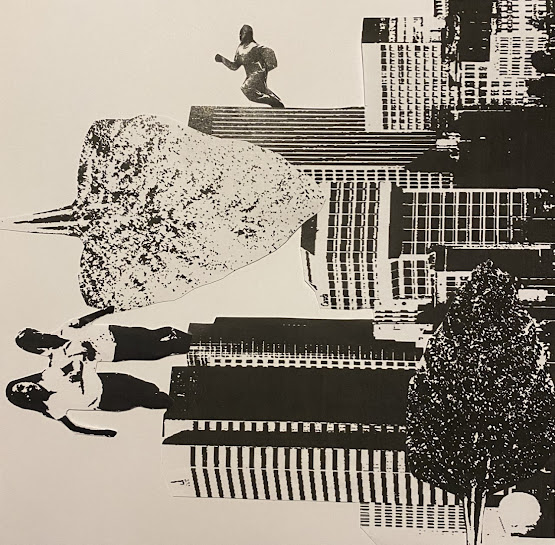

This other arrangement is a lot emptier than my others; the idea was to produce multiple scenes in one picture again not really paying attention to the scales of the different element, the randomness of the composition leaves the viewer able to interpret where they think the horizon would be and what is happening in the picture.

Another one I did was two pictures in one, when looking one way the building appears to be on the ceiling and the other way is tress and children are upside down. It could be interpreted as urban vs nature depending on the way it can switch.

1. If all the elements are completely horizontal and vertical in relation to the frame what dynamic is suggested? What is your opinion about this image and what sensation does it communicate?
It keeps the dynamic compact, especially the two arrangement where it only included the building by themselves and the buildings with trees. This composition behaves like a photograph because it is a type of landscape shot, you would likely produce if taking a picture of a city. The image with just the buildings I imagine they are full of people even though you cannot see any. However, another part of me imagines the city being deserted and just the buildings remain. It a nice picture to look at and you can come up with scenarios of what you think is happening or the sounds you might be, this is the same for the one containing trees, I think the trees make it seem like the city is inhabited and it is a bit more peaceful.
I think when a picture has only strictly horizontal and vertical elements it can seem tidy and attractive, but it can also seem a bit boring like someone has taken a standard picture, there is no flavour and originality. When things are overlapping and angled differently and such it leaves more to the imagination, you can find your own interpretation as to where a horizon it and what the perspective suggests.
1. Which is your favourite composition? Explain why you feel it is most successful.
My favourite composition is one of the most basic out of them all, I like this one firstly because of how the black background makes the white in the buildings stand out. The fact everything is within the frame and in line with each other its aesthetically pleasing to look at. Even though it is a simple composition there is a singular building that produces out the top of the page it shows the vastness of the building, it puts into perspective how big buildings can be and I have emphasised that with letting it run out of the frame. The most successful part about this image is how I unintendedly organised the darker building at the back, so it seems they are fading into the black background. The white on black exaggerates the layers and distance between the buildings giving it a bit of dimension and depth.


The work I have done for this exercise went a bit beyond the brief as I used multiple versions of almost every object on both black and white backgrounds and expanded the placement of things going outside the frame. I decided to redo but only using white background with one print off of each object (one set fo buildings, children, one of each tree..) for a more focused structured picture.


So this time around I stook within the piece fo paper. I kept the first of these 4 realistic with and obvious horizon and distance between things made it look like a picture as for the others I made it so the buildings were either upside down or on their side and placed the kids and trees in random places like tooked behing the building as if they were giant trees or the children having the ability to run on the side of building or giant children on top of the buildings. With all the directions it gives the reader a busy picture to take in rather then just beung a regonisable setting like the first one, it turns on the imagination as to the possble causes for why the building are in the sky and kids and trees are floating below.
Comments
Post a Comment