Part 5 Exercise 2: Editorial Illustration
Buying some newspapers (the sunday times adn the observer) there weren't many with illustrations in in the supplements but I did manage to find 5 good ones and two that were relevant to the list of headings given within the newspaper itself.
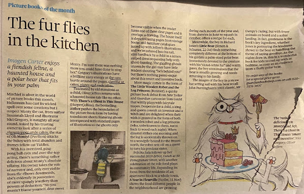
The fur flies in the kitchen
There are two little illustrations used in this text, both seem to be representational and narrative as they’re based on picture books of the month. The text explains a little about the books/illustration it the ghost in the mirror illustration is representational because it’s said that the ghost appears when the reader turns over a transparent sheet in the book. The second of the cat “Oh Monty” he’s eating cake in the illustration and again this is representational as it follows the books narrative in which Monty’s owner has told him to mind a series of cakes and being mischievous eats them instead.

I’ve got an unskiled feeling about this
This articles illustration is a pair of school shoes with an ‘unskilful’ sticker on the shoes. The illustration is probably a bit metaphoric in the way school shoes and getting a sticker is things you’d associate with being in school. The sticker on the shoe correlates with the title and the meaning of the text which is about the use of words in school reports and changing certain parts of the school system to make it better for pupils, so using ‘skilful’ and ‘unskilful’ instead of good and bad.

They died before their battle for compensation was over
This illustration is metaphorical as well as having a narrative as it relates to the article well, people were passing before they were given compensation for time shares and the remaining bills were left to pay by families and such. In the illustration it shows men waiting in line ranging from young to old and in a wheelchair with a clock on the wall which represents the passing of time standing in this line till you get old and eventually die.
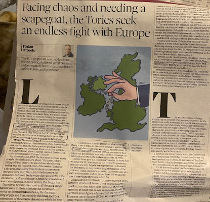
Facing chaos and needing a scapegoat, the Tories seek an endless fight with Europe
This illustration is showing Northern Ireland being stitched to the rest of Ireland or is being unthreaded. This idea makes the picture metaphorical as it is making a visual representation of a political issue about a rewrite of a treaty and Brexit that would mainly affect Northern Ireland the part being held together by stitching. It is also metaphorical because sewing a country isn’t possible. There is a hand holding this thread which suggests it is the fault of the people in power.


I found 2 articles that related to the commissioned headings “how green is your food” and “the object of my desire” or “throwing your money away”
The name of the article for the green heading is called ‘how to make your kitchen leaner and greener’ which is already like the one for this exercise however when reading the article, it was more about appliances and such rather then food and facts as such so I thought the other article for money and desire would have a lot more options to explore.
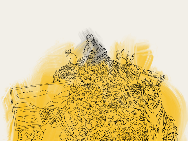
The article I chose is called Step off the pleasure treadmill and cure your treat brain. The text is about treating yourself and how if you do that to much such as retail therapy it makes it feel as though it isn’t a treat anymore, the happiness has baselined. In the illustration it is a cartoon lady surrounded by material things and food and its full of colour and shapes. These elements relate to the writing, so it is a representational piece. I chose this one with the heading of “the object of my desire” instead of “throwing your money away” because these ideas are dissected in the article rather then having the bedside of throwing your money away cause its about treating yourself but also has the problem with it.
Going through the article I picked out some words that I could use to put together some idea of what I want in my illustration:
‘Treat yo self’
‘Hedonic treadmill’
‘Attempts to cheer ourselves up’
‘Treat obsessed brains’
‘Too many treats’
‘The more I fought to delay gratification the more meaningful and treat became’
I then created some visuals and unconscious sketches when going through the article to collect these words and then chose some of my own words that I would like to convey.
Simple definition -The Object of my desire – something that people want to have


After these sketches I focused on the idea of someone being surrounded by all these material expensive things and still being disappointed metaphorical suggesting you will never reach the object you desire cause if you do they’ll be a new object of desire which results in a cycle of wanting things you think may make you happy.

I searched
material things and exotic items to include in this pile and the man sitting on
the top is in obvious disappointment even though he’s surrounded by extravagant
things.
first image I piled all the objects together and added a back shadow which reminds me of a urban magazine collage type image.

I decided to go digital to create this illustrations but use tradtional medias like the oil paint tool or watercolour...
Thus watercolour versions relates to the object of my desire theme in a sense to the idea of temporary happiness by the way the colours behaves and how they can be washed away. I also like the effect it produces of the fluidity of the colours. and the messiness which reflects the mess fo items under the person on top of the pile. the use of only grey an yellow reflects the wealth of gold and after a while everything gives you the same feeling cause you have everything. A theme I followed was using colour for the material objects but have the person grey to show a contrast between the moods. Excitment compared to boredom.


This one I went full colour just adding as many colours as I could just to show the excitment for all the things in comparison to the girls expression being surround by it all.I dont like the harsh changes between colour on this one it looks abit too messy and rushed.

Finally this was an obscure creation, I removed the lines and warped the colours instead.It is an abstract colourful shadow of the original. It may not make sense if used for the arcticle but It would make the reader woner and intepret what the connection between the text and illustration could be. I still kept the grey vs colour theme. I think maybe it is abit to simplistic ot see what its supposed to be and i am biased because I know the backstory.

With the original title I pasted the first image with full colour.


This version of the illustration is the one is a lot simpiler then the full colour but I like it the best as it shows a more obvious contrast in colour, one being gold to symbolise wealth and matrial posessions compared to the grey of the girl on top in realation to her mood being sad or bored for example.The fluidity of the way its coloured in too is also again that idea that all those things arent permanent.

This illustration has a more hidden meaning and probably would confuse people if it was used for the arcticle, I think it would only make sense to me or if it was explained underneath. I suppose people could have there own intepretations if really intrested but I dont think its very practical.


.png)
Comments
Post a Comment