Form and function Ex 3: Book designers part 1 (artist research)
Undertake a combination of library and internet research into the
following designers, identifying a number of book cover designs for each.
Reflect on their conceptual and/or expressive approaches to design. Write
a very brief description of your selected cover designs and a brief overview
of the designer - try to focus on keywords rather than long descriptions.
Do this in note form, using the designer and the chosen example design to
visually inform how the information appears in your learning log.
● Phil Baines
Expressive work, his style is very unique as he seems to use a fair amount of typography to make up the imagery and there is evidence of conceptual themes like this Marco Polo book he uses illustration with typography to make up the picture. The way in which text is used is quirky changing in shape, typeface, size and colour. There is also no image on some of his covers just this interesting use of typography.


● Derek Birdsall
Conceptual designs a lot of the time, the design usually represents the title in some way like the American flag with one of its stripes replicating a graph in relation to the capitalism rises and falls. Similarly, the design with the no enter road sign also related the ‘the city’ title. I think there is an essence of expressionism with the use of simplistic colours and shapes. Some covers are quite structured with title and image underneath and then others being a bit more out there with the positioning of text being down the side of the page, diagonal or in the centre.


● Kelly Blair
There’s a mixture of conceptual and expressive. Most of the imagery on the cover characterizes the title, there’s a look of cut and paste collage where a photograph is merged with a silhouette or another image as if papers have been torn and put together. Same with the nightingale book cover with the ripped pictures of birds taped in a row. As for the text it is often petite and stylish not a big focus but clear enough to make out it is the title.


● Irma Boom
Very unique designer and this mainly due to the fact that all the books range from regular size to tiny, these tiny books are still designed and printed as if it was a regular sized books but they’re shrunken versions. The thing the designs have in common is the bold text and professional default looking typeface, there very aesthetic. Black, white, red, and yellow make these books satisfying. I love the novelty of the small pocket size books. As far as being conceptual or expressive there isn’t much imagery, pattern, or unusual design other than the size.


● Suzanne Dean
Very expressive, patterns, line work, floral, mark making are all elements I’ve noticed throughout the designs. Negative coloured covers and silhouettes are prominent. As for typeface and text it isn’t very thick but they’re clear enough compared to the busy backgrounds or sometimes the colour of the text changes to be opposite colours from the background.


● Julia Hastings
Julia has a very minimalistic and cool style. The designs are full of textures and don’t look stereotypical hardback books you see, there’s those extra 3d features. Another design feature is the use of dust jackets, pockets, or parcels to surround the book. Her work is expressive I feel because there is no real direction in the designs in relation to what the book is about.


● Linda Huang
Conceptual more often than not, her designs are versatile she adapts her style. The only things that differ is the imagery and colours, they’re very colourful. The text seems an important part of the designs whether it is as regular title or not, the typeface is also adapted to the books theme ranging from a bold but slim lettering to 3d writing or different shaped letters and some of the words also bend around something in the background or within the image such as the Interior Chinatown book or used as a headline on the front of a newspaper.


● Jost Hochuli
Jost’s design are expressive. The designs have an emptiness that looks quite stylish, there is minimal pictures on the front of these but they’re subtle and I think that’s the use of softer colours. The aesthetics are also elevated by the textured patterns, the little cut outs (dinosaur). The text is tiny and it is like it’s been quietly placed somewhere on the page the edge or just half way down the page. Even when text/numbers are used the pages are still kept clean, the numbers overlap each other creating new colours.


● Paul Rand
His designs are conceptual wrapped in expressive and this is because of the abstract colours and shapes. The designs are also conceptual because they are used to illustrate the title such as ‘The second man’ with two silhouettes of men and the Swedish flag being used for a book on Swedish builds. The text is pretty plain and looks like its there for the purpose of just being a title which isn’t a bad thing.


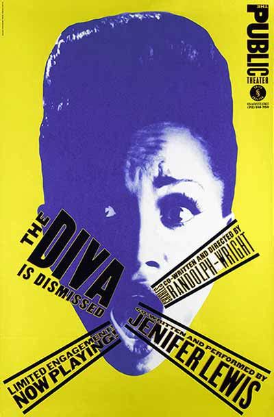
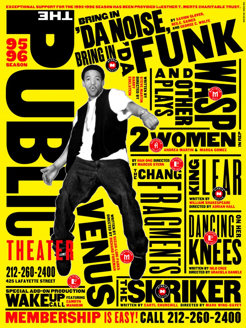
● Paula Scher
The text is what makes these designs expressive, there is so much text to fill the page easily readable and surround the images. These designs are quite quirky and definitely eye catching with the black text on yellow page with a cut an paste type of style like a fanzine placement of things on the page.

● Wolfgang Weingart
Geometrical in design Weingart covers are sharp and very shape orientated. The shapes often follow the grain of the text or to redirect focus to a certain part of the page. I’d say these designs are expressive.


.png)
Comments
Post a Comment