Text, Image and Typography Part 3: Ex 3 Experimental typography
This exercise I was asked to read an extract from Jules Verne’s 20,000 Leagues Under the Sea. Using a single typeface of your choice, lay out the text in as inventive a way as possible. Experiment with the letters and words, using the typographic principles you researched in earlier exercises to significantly alter the arrangement of the text, its rhythm and readability.
Firstly, I did this part for the brief... "Think about design group Tomato’s definition of typography – ‘Sound as form’ – and how this concept might apply to your own work. Use the content of the text to inspire visual ideas. How might you experiment with the type to communicate something of the essence of the descriptive content? Think about how the designers you researched in the previous section, e.g. David Carson and El Lissitsky, would approach the text – or artists like Marinetti and Schwitters. "
To communicate something using text, typeface choice can do this well even before figuring out layouts. Using a vintage text like Old English with a complex old style could take a page back in time, the setting for which the text was written could be to showcase a certain period in time, an old newspaper or poet etc.. On the other hand, using a modern typeface perhaps with a sans serif could help reflect something read today with a minimalistic look and the use of serif could make something look a lot more serious or official. Leading and spacing and letter length could be the difference between things like the readability, approachable, or boring, serious, childish and target certain audiences depending on the complexity or simplicity.
Moving over to the internet I researched a few graphic designer and artists to see just how they would approach typography designs...
David Carson
David uses his typography designs to send a message. Quote taken from the website below from William Burrough 'The word is and image' this shows how he feels about typography it not just text it a visual. Reading into is process he chooses a font according to each project and doesn't overlook the message behind the any font. It will be used to carry the information and help reinforce a message. He also says not to get lazy. He uses collage in his work, it’s always a busy with text that mix and overlap. It's not just simple text it an exciting imagery like it’s been thrown at the page.
Butler, A. (2014). interview with graphic designer david carson. [online] designboom | architecture & design magazine. Available at: https://www.designboom.com/design/interview-with-graphic-designer-david-carson-09-22-2013/.
https://www.masterclass.com/classes/david-carson-teaches-graphic-design/chapters/send-a-message-with-typography
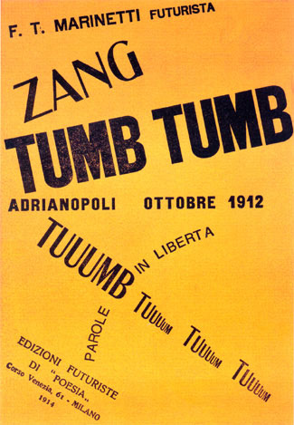
Marinetti
historyofinformation.com. (n.d.). Marinetti’s Incunable of Poetic and Typographic Experimentation of the 20th Century : History of Information. [online] Available at: https://historyofinformation.com/detail.php?id=4000 [Accessed 18 May 2023].
historyofinformation.com. (n.d.). Marinetti’s Incunable of Poetic and Typographic Experimentation of the 20th Century : History of Information. [online] Available at: https://historyofinformation.com/detail.php?id=4000 [Accessed 18 May 2023].
Luchetta, E. (2019). Futurism and graphic design: the typographical revolution and incredible book-objects | Pixartprinting. [online] The Pixartprinting blog. Available at: https://www.pixartprinting.co.uk/blog/futurism-book-objects/.
The composition of letters on the page now had to visually reproduce the verbal expressions they contained.
"The Futurist typographical revolution began in 1912 when Filippo Tommaso Marinetti wrote his first “parole in libertà” (words in freedom), works in which words have no syntactic or grammatical connection between them and are not organised into phrases and sentences. The style was as phonetically revolutionary as it was visually. The sounds of the words, often onomatopoeic, and their typographical treatment on the page are of utmost importance in this blend of literature, music and visual art. "
"The typography reflects the crude and evocative power of the language. Rather than follow the rules of syntax and punctuation, the letters come alive and express themselves on the page."
Marinetti similarly uses creative forms of typography, through collage. Different typefaces, hand arranges and various sizes. This piece for example shows the explosion of grenades and shots from a weapon. He uses words to create images. Onomatopes are features when expressing sounds and noises of battle. He uses many different sizes, fonts, bold, italics..
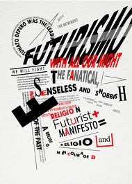
more examples of Marinetti's work
El lissitzky's typography work is quite geometrical, mechanical looking. The words he used a lot to represent political ideas combining serif and sans serif. The letters are actually figures in some pictures, I see a lot of minimalistic features, the blank background with just type no images. The words make up the image whether they’re diagonal, scattered, uniform or separated in some way.
The Art Story. (2016). El Lissitzky. [online] Available at: https://www.theartstory.org/artist/lissitzky-el/.
"The words on the printed surface are taken in by seeing, not by hearing. One communicates meanings through the convention of words; meaning attains form through letters."
Kurt Schwitters
Harvard (n.d.). The New Typography of ‘The Ring’ | Index Magazine | Harvard Art Museums. [online] harvardartmuseums.org. Available at: https://harvardartmuseums.org/article/the-new-typography-of-the-ring.
"principles such as asymmetrical composition and the utilization of negative space, as well as sans serif type, photography, and photomontage—in stark contrast to traditional approaches."
The Museum of Modern Art. (n.d.). Does Content Matter? In Kurt Schwitters’s Hands, Typography Transcends Language | Magazine | MoMA. [online] Available at: https://www.moma.org/magazine/articles/531.
Ellen Lupton elaborates on Schwitters’s typography:
“In this poster for a car show, Schwitters was experimenting with creating a new alphabet. It really annoyed him that the letters of the alphabet are so arbitrary. He wanted to reform the writing system so that the shapes of the alphabet would have more of a connection to the sounds of speech. So, if you look closely at the letterforms in this poster, you’ll see that all the vowels are drawn with curves and the consonants are drawn with straight lines.”
Schwitters’s focus on crafting the letterforms in a way that is disconnected from the content proves that shaping form can be a meaningful act in itself
Like Carson his work has a lot of collaging, abstract art creating 'complex space through overlapping' his typography approach is the same as his drawings, similar if not the same technique. Kurt was a Dada artist and poet, so these techniques were intertwined. I think his work looks like a ink stamp with all the overlapping an off white paper.
The main goal of the brief is to use all this research and experimentation in this section an incorporate the techniques to make the extract come to life thinking about 'sound as form'. So, after I did this research I then started to dissect and analyse the use of words and imagery in the text. Picking out words that stood out and ideas. How Interpreted the text was me using my imagination and trying to visualise what was being described.
Chapter 1, A Shifting Reef
The year 1866 was signalised by a remarkable incident, a mysterious and puzzling phenomenon, which doubtless no one has yet forgotten. Not to mention rumours which agitated the maritime population and excited the public mind, even in the interior of continents, seafaring men were particularly excited. Merchants, common sailors, captains of vessels, skippers, both of Europe and America, naval officers of all countries, and the Governments of several States on the two continents, were deeply interested in the matter.
For some time past vessels had been met by “an enormous thing,” a long object, spindle-shaped, occasionally phosphorescent, and infinitely larger and more rapid in its movements than a whale. The facts relating to this apparition (entered in various log-books) agreed in most respects as to the shape of the object or creature in question, the untiring rapidity of its movements, its surprising power of locomotion, and the peculiar life with which it seemed endowed. If it was a whale, it surpassed in size all those hitherto classified in science.
After having a read though of the text, I picked out some words and sentences I could play with. The words being descriptive in the second paragraph I focused on that rather than the whole text. Using a mixture of paper and digital I think the digital I could create better pieces because all the colours, fonts and images were easily accessible.
I started of in my sketchbook doing the initial planning like using illustrations and having the text around it or having the object making a path through the text as if its moving. I had ideas in my head, but it was hard to replicate hand drawn on the page. Using my iPad I could see everything laid out and if it didn’t work just move it without having to start anything over.
These initial and Loose ideas, I thought about, the period it was set, the shapes the text could take, the spacing and kerning of the letters, the charatceristicis of the typefaces as well as the use of the mysterious object visually. I thought of playful ways to incomporate the words into pictures like using the shape of a boat through the text relating to the nautical context.
Firstly, I set out the text on a dark background and other with the ocean and just added the text as a base.For the shpae of the text I looked for some inspiration on pintrest fidnign soem strange text layouts. I tried using a warp tool to create waves and although not perfect I got the gist, I also used letters to create bubbles and trails throughout the text.
My sketchbook sketches^
pintrest inspiration
waves and bubbles made with letters and making a path through the text ^
The descriptions Spindle- Shaped and occasionally phosphorescent I formed visually, using a change in colour on a particular part of the paragraph or a complete image of the mystery object. These were only simple ideas.
These 3 with the use of the typeface remind me of a blurb of a book with the mystery object floating about.
This Menlo typeface I think really bring a Sci Fi feel to the story, it looks like a thing youd see typed on a scienfic computer for experiements or confidential files. It's like its typed as a study and it makes for an eerie read.
Following on from the Sci Fi theme, vintage horror film and sci fi film posters came to mind.
again having a look on pintrest I came across the type I like. the 3d text, block titles taking different shapes and fitting nicely in some way.
My designs
I had fun manipulating chosen words giving a slight sci-fi theme with things like the glow of the creature in question, exaggerated sizes and shapes of other words, even using the word whale pasted on an actual picture of a whale. While I do like these alien type posters I also had the idea of a vintage nautical poster seen around the docks back in 1866 pasted on the wall with the text written on it, not the exact words of course but the essence as if it was a “HAVE YOU SEEN THIS CREATURE” sort of thing as this object was a well-known rumour. Along with this a journal entry on weathered paper come to mind to, imagining a sailor or traveller witnessing this creature and writing as well as sketching it, all of its features such as ‘untiring rapidness’ or surpassing the size of a whale and the phosphorescent nature.
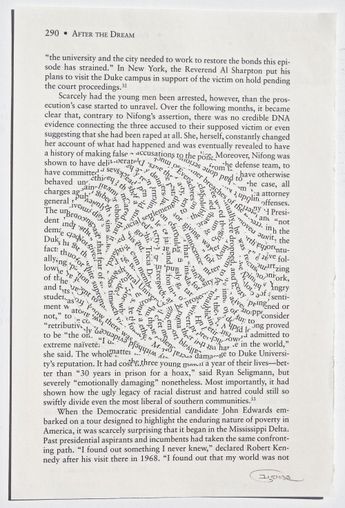
Another inspired digital version was in similar taste of Kurt Schwitters and hi use of letters and words to create images as well as text overlapping. The use of overlapping text and the words making
up a picture such as the ‘spindle-shape’. I relied more on the design being
readable than total chaos. The shapes of the movements described in the text I slipped into the background as reminance of the creature moving.


.png)
Comments
Post a Comment