Text, Image and Typography Part 3: Ex 1 Type sample
This exercise was about Typefaces and their uses and qualities. I expreimented and analysed their uses, shapes and what I think about them as a typeface.
Identify
Having a look through the fonts on Word and my iPad app Procreate I discovered that some texts listed above they had as a default but there were also a few that weren’t.
The fonts that I could find:
· Garamond
· Times New Roman
· Bodini
· Didot
· Helvetica
· News Gothics
· Futura
· Old English
· Engravers Text
The fonts that weren’t available:
· None of the suggested Square Serifs. So, Clarendon, Stymie, Lubalin graph
· None of the script such as Commercial Script and Zapft Chancery
· And finally, the decorative type Comstock.
In addition to these, I picked a few other typefaces that I liked and some that were a bit different then each other so I could guess what category of style they’d fall into as well as if they were serif or sans- serif. I then printed some of these off and stuck them in my sketchbook as references aswell as collecting some other pictures liek online news and magazine websites, as well as leaflets, menus and parcel receipts and books.

Reflect
Also I write down mini bubble maps in my notepad of each typeface and described them with a few words and sentences.


I picked 5 typefaces out of all the print outs and tested out what they would be appropriately used for and what they wouldn’t work being used for. (Georgia, Times New Roman, Futura, Comic Sans, Old English)
Magazine - Georgia
Newspaper – Times New Roman, Old English
Online – Georgia, comic sans, Futura,
Educational text – Times New Roman, Georgia
Leaflet – Futura also good for trade manuals
Book – Georgia, Times New Roman, Old English but more for headings and titles
Poetry, album covers, brochures – Old English, Futura these text I can see for logos, beer labels, medieval pieces, old books.
Old English – This text could work in a magazine dedicated to history, Newspaper and Older issues of things. This text is very title like, and it gives a decorative edge, puts an era or vintage age. I do think however it would be too intense to be a whole book or page worth as the letters are quite complex.
Times New Roman – I think this typeface would work for almost anything as it’s so universal and yet it still has a stylish look. I can imagine it being used for a bespoke magazine or online version, it has an aesthetic shape and I think it can be appropriate in a classical or modern setting. TNR would also fit well for an educational publication, newspaper, and online resources like Wikipedia. It isn’t to fancy but it’s also not to generic looking.
Futura – Futura is a friendly looking text but slightly odd due to its straight shapes and smaller spacing. I think it looks tidy without any serifs. Its compactness means it would look good on a blog, online website, leaflets, logos, ads… However, I don’t think it would be appropriate for something too professional like an educational publication or books because of its bold, compact look. I think I could see this being used in a magazine.
Georgia – I really like this typeface, it a cosier version of times new roman. The thickness of the letters varies, and some edges are rounded. I can’t see this being quite universal. Books, Articles, Newspaper, leaflets, creative pieces like poems. It has a casual but also a professional look.
Comic sans – Out of all the texts I’ve chosen I like this the least. I think it looks lazy and cheap, its almost like a comical text that isn’t used for anything serious. Drafts/planning, PowerPoints, labels I feel it would be appropriate for, it reminds me of the default typeface in PowerPoint in school. I know that it is one of Microsoft first default fonts back in the early days of the computer and I think it captures that time well. I would not use comic sans for anything professional like an educational publication, letters, books, poetry but maybe be suitable for personal blogs.
Examples of these typefaces being used appropriately and not so fitting examples
comic sans over a book, professional paper, letter (all bad) but good for powerpoint, personal blog, label, kids homework/worksheet
georgia used in books, online news, newspaper, poems
Futura being used for a book (bad) online magazine, logo, ads, publications (bad)
Times new roman publication, book, website, newspaper, poetry
Old english old script, books for titles, religious text, poetry, newspaper headings but not good for full texts of a book, article, website...
Here are some examples of text looking a certain way on different platforms. I added a selection of typefaces for the BBC news heading, a scientific report and national geographic website

Old English, I think this text would be cool but considering how much modern the other text and layouts are online especially it looks out of place. I could see a more vintage traditional looking news website using Old English however maybe like a throwback.


Savoye is too complicated for the news; it has a bit too much personality and its delicate shapes and line don’t look very title like.

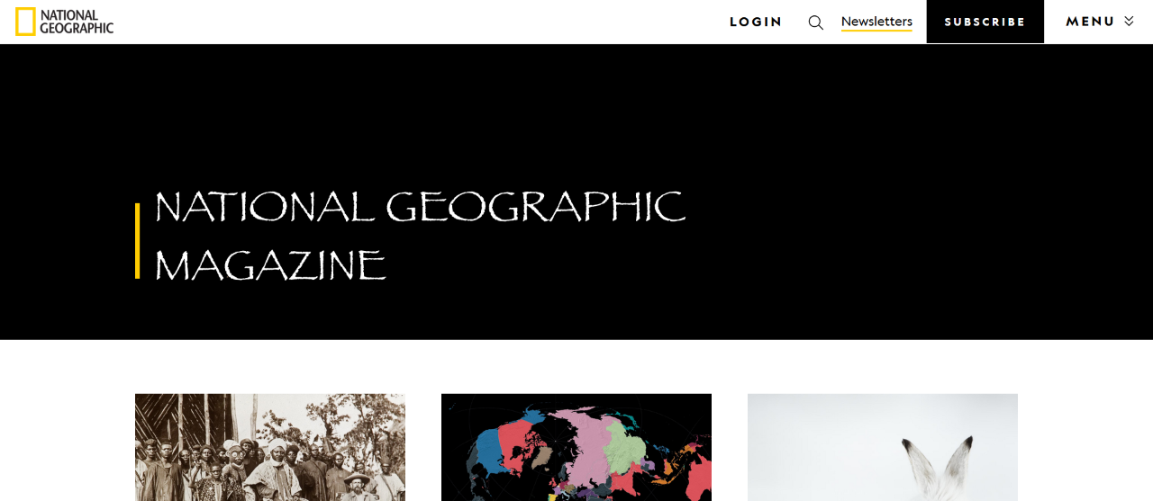
National geographic website front title

Georgia. This fits well with the page I think, it looks mighty to me, and this is good because it’s a worldwide magazine which reaches a lot of places, it’s clear, professional and the use of serifs gives a timeless look.


Another example of using typefaces in different settings this time being used for a scientific report on robots, taken from an online publishing I found....
Sun, Y., Zong, C., Pancheri, F., Chen, T. and Lueth, T.C. (2023). Design of topology optimized compliant legs for bio-inspired quadruped robots. Scientific Reports, [online] 13(1), p.4875. doi:https://doi.org/10.1038/s41598-023-32106-5.

Copperplate. I think copperplate is a bit too intense for a scientific piece like this, it’s too theatrical and wide, I think. It takes away from the seriousness of the report. It could maybe work for the title at the top but not really from the main body of text. Everything is in capitals so it’s like you have to shout when reading it.


Develop
I found some odd everyday texts around my house, tracing from, wrappers, manuals, shoe box, books and a receipt shaded the appropriate parts of the letters to replicate a print or stay true to the design.

I traced this accordingly to the typefaces themselves, darkening the darker areas and shading places to fill in the shapes to reflect the weight of the letters. These varying shades represent the depth of the typeface, such as rich tea and SpongeBob having a 3d shadow around the letters and then the Fitness being flat as it looks originally.
Document and present
I think these collections of typefaces, letter shapes and styles I could definitely experiment with throughout this part and for the assignment. Dissecting the features and qualities of the typeface may help in creating different feeling visuals because of the diversity.


.png)
Comments
Post a Comment