Part 2 Assignment 2: Happy Accidents IS
'Your first task is to look back at the collection of Facial Pareidolia you gathered for the last exercise'
Here are some of the pictures...


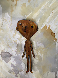
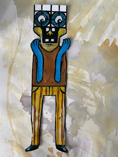
I made 2 into digital characters


I have also rendered some other pictures as painted versions and printed some out to and drawing the rest of the bodies.
For the background ideas I flipped through my sketchbook and using the view finder found some different areas of background that I liked from previous exercises. In addition to this I stuck some magazine pages and old birthday/Christmas cards down and collaged them on one page to offer varied colours and textures. I wanted to create a new background because I wanted to leave my other exercises as they are but the characters can be easily moved as they're only stuck on with bluetac just in case I did want to change their scenery.
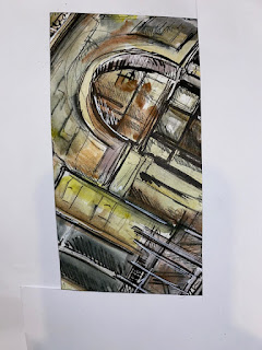
Newly found backgrounds


Backgrounds from rest of sketchbook


These are the characters on their own before they take a trip to sight see through my sketchbook.

lightswitch reference


Cemetery Gate reference upsidedown


Car cup holders and gear stick


The front of a draw for reference


Finally The playstation control pad

Here I took the characters on a trip to different backgrounds to see how relatable they were or if they fit in well.

Newly found backgrounds
Firstly, I used the drawing with teabags exercise, I think they all fit well with this background. The stain of the tea together with the wooden character creates a vintage feel and its expression seems approving of the splashes and lines... As for the light switch character It can relate to the fact he has a glass in his hand and maybe spilt it all of the page yet he’s still stood casually unbothered. The gate face expression seems to be a good reaction to the mess around him, I don’t think I would put him on this background however due to his style and his colours being so intense.
I then tried out the miniseries of Lucy Austin inspires pages.


This paper shape page I don’t think matched any of the characters energy, maybe this is because of the clash of colours, However the light switch head looks quite comfortable amongst the shapes. It kind of remind me of someone going to view high end art in a fancy museum or exhibition and the piece of art is behind him like he's looking at it in his head.


Another page from Austins inspired pages is this acrylic painting, I think the background is a bit too busy for the characters, the wooden character and gate character have very fitting expressions for the chaos behind them.


I only used the gate head for this page as again the expression is most fitting, the background gives of criminal maybe murder vibes so of course the character is shocked. It also helps that the colours are similar besides the little bit of blue that breaks it up. In the end though I did end up using my newly made backgrounds rather the previous exercises.


I purposely pointed this character’s eyes down cause I knew looking through the magazine that this would be great in giving context to the expression, I like the contrast between real life and the bold lined cartoon and the painted on AAAAAA. It’s that humour that I wanted to include.

I didn’t really have an idea for this character head, I couldn’t think of what its body would eve look like so instead I found a serious picture of this suited model and pasted its head on over hers. I t looks like she’s wearing a mask and it takes a bit of the seriousness out and adds a bit of quirkiness instead, the colours of the suit also sort of match the face. If I saw this in a magazine, I feel like it would be as a statement piece with some meaning behind it or an art piece of some sort.

I tried to find wooden furniture or cottage type pictures but instead this modern kitchen set up was all I found. I actually like this mixture of sleek solid colours with this random wooden character in the corner admiring the light. I think this is my favourite character it seems the most realistic in the sense you could see him being used in a children’s story.


As an add on I did find in a previous personal sketchbook even before starting this part that I'd actually used pareidolia before just sitting in my room bored; so of course, I had to add it to the empty space. I even annotated the character and gave him a mouth an eyebrows just to show the personality Imagine him to have.

For the armchair collage page, I didn’t have a character for it so I went through the pictures I collected and randomly had the idea that I should use a post it notes for a character and draw the body straight onto the background. The use of a 3d post it note with the draw straight on the page is different than if I were to keep it flat on the page. Because the pen is dark, and the background is the post it notes helps make the face clear. It is just an experiment; it looks like the head is out the page almost. For the body I stuck to the robotic theme and is a contrast to the furniture and natural elements.
So, I have used a mixture of colours, collage and full magazine pages including people that the characters faces have been stuck over. The use of furniture I think provides a calm casual environment which is the opposite of some of their expressions and shapes of the characters. I tried introducing some humour through my characters and their backgrounds like the one where the gate face staring at the women lying on the floor as if she’s unconscious or the shocked car cup holder face being on the body of a serious model wearing a suit. I enjoyed experimenting with the environments and digitally creating some characters to inspired by Christoph Niemann. Creating from imagination I feel sometimes it’s more rewarding then using reference because you've created something that doesn’t exist and especially when it characters you can play around with and bring to life.


This assignment stretches across 8 pages showcasing each character in their own scene. I also included my digital characters and a little flappable deck of cards at the bottom not only to save space but to carry on that interactive element that makes it a bit more interesting. And I just printed of other example of facial Pareidolia and some I found in a magazine.


.png)
Comments
Post a Comment