Form and Function Part 2: Assignment 2 Form and Function
Design the book format and cover artwork for two different versions of Daniel Defoe’s classic 1719 novel Robinson Crusoe. The publishers, Viking Press, have decided to re-release this title as a new pocket edition for readers on the move that reflects the adventurous nature of the story within a contemporary setting. This paperback version should have a modern visual feel that can compete with new titles in the bookshop. They also want a deluxe edition for armchair readers and classic book collectors that references the historical nature of the story and its associations. Produce book design ideas and cover artwork to reflect the content of the story across both formats and contexts. Be creative and inventive with both the look and format of these books.
To start this assignment, I searched for all the different covers for the book had, there were A LOT. Some for hardbacks, children’s versions, classic collectors’ version, vintage… Luckily, I was familiar with the story but refreshed my memory with some chapter summaries. Reading these summaries, I picked some key words and themes throughout the book. These keywords were a good starting point when trying to establish the atmosphere and the tone of the text relating to the existing covers.

As there are multiple editions being released such as a pocket version paperback and deluxe edition. I searched for books that fit each category and created a list and brainstormed the features of each.
I also researched paper stock, scale and size, print, dust jackets and flaps for each edition. Exploring the qualities of all these I wanted to reflect the story, the isolation, dirty, old and a suggestion that the pages are affected by the elements on the island but still in a professional way such as using untreated natural off-white papers.


DELUXE VERISON
These mind maps are all the features and qualities I used. I firstly began thinking about the deluxe version, I wanted it to have an essence of Crusoe’s diary. Unlike the paperback, I had a lot more interesting choices for materials that looked like leather, cloth, or skin similarly to Crusoe’s self-made clothes as well as possibly giving the book a case with a clasp like a diary. These were the references for the structure and style I had in mind.


My own purse, the bible and a notepad of mine


Another design for the deluxe I want to create is to have the hardback cover to be debossed with different colours, possibly gold to reflect Crusoe keeping the coins from the shipwrecks but them not having any worth on the island. These images below show the technique and classical pirate like style I liked, the gold on brown I think looks eye catching as well as some covers having multiple colours of debossing and embossing that also look very pirate and nautical.


Another design for the deluxe I want to create is to have the hardback cover to be debossed with different colours, possibly gold to reflect Crusoe keeping the coins from the shipwrecks but them not having any worth on the island. These images below show the technique and classical pirate like style I liked, the gold on brown I think looks eye catching as well as some covers having multiple colours of debossing and embossing that also look very pirate and nautical.
The foiling is so stylish; the Perfect look for book collectors who like to have that decorative edition of a book that can be kept for years looking strong on the bookcase. The durability of having a case in addition to a hardback is an even cooler design feature especially the diary concept brings the story to life.
PAPERBACK VERSION
The paperback I wanted to keep the design painted and slightly worn looking for the ‘vintage’ effect. I looked at some of my own pocket size/small books to examine the binding, page thickness and amount and the flexibility. What help me a lot with deciding the sizes, paper ect was the sample book I received from ImprintDigital.com. There were useful pages in this book. I concluded that A5 is a great size for the pocketbook. I thought about a matte finish for the cover I think it was the most appropriate because it’s not too fancy, the book is about being in the elements alone on this random island, where wealth doesn’t mean anything so having a gloss or silk finish wouldn’t match the atmosphere as it would look to polished.
Sample book I referenced throughout my design process, choosing paper stock, paper GSM, finishes and treatments and sizing/scale.
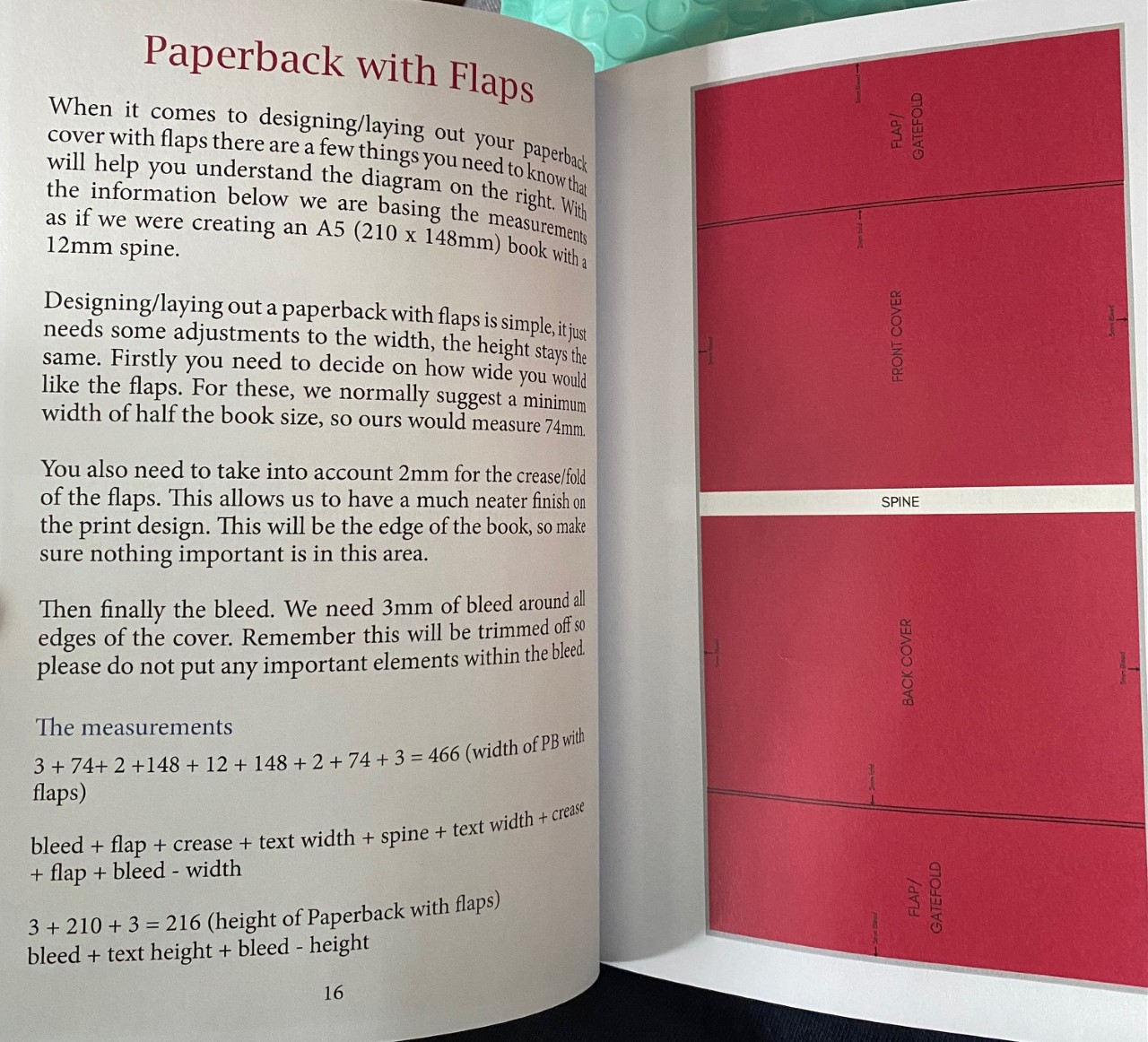


This size page of the sample book was extremely helpful, I knew I wanted the paperback to be a round A5 or a little smaller to be pocket size and still readable whereas the deluxe versions A4 would have been too big but this comparing the sizes I think template for the one up from A5 named 'royal' would be perfect (234x156). It's not so big that books block (page amount) is lacking and not so small that the book is very thick. It gives me space to use the techniques on the cover such as debossing.
I knew I would be using flaps for the paperback and again the sample book had helpful guidance on working out the sizing of the books, flaps and pages. After these mind maps and first doing some initial research, I wanted to do the actual cover art before all the measuring and the technical parts that would being the books together.
More helpful information...


The Design Process
Starting the designing process, looking though all the different
covers for paperback versions of this book most if not all had Robinson Crusoe on
the cover with either a parrot, dog, a native (Friday) he saved in
the story or him on his own with a background of the island and ocean. The hardback
decorative versions also had these images but, in less detail, due to the foiling
and debossing. Here are just a few covers...


Presenting Visual Outcomes
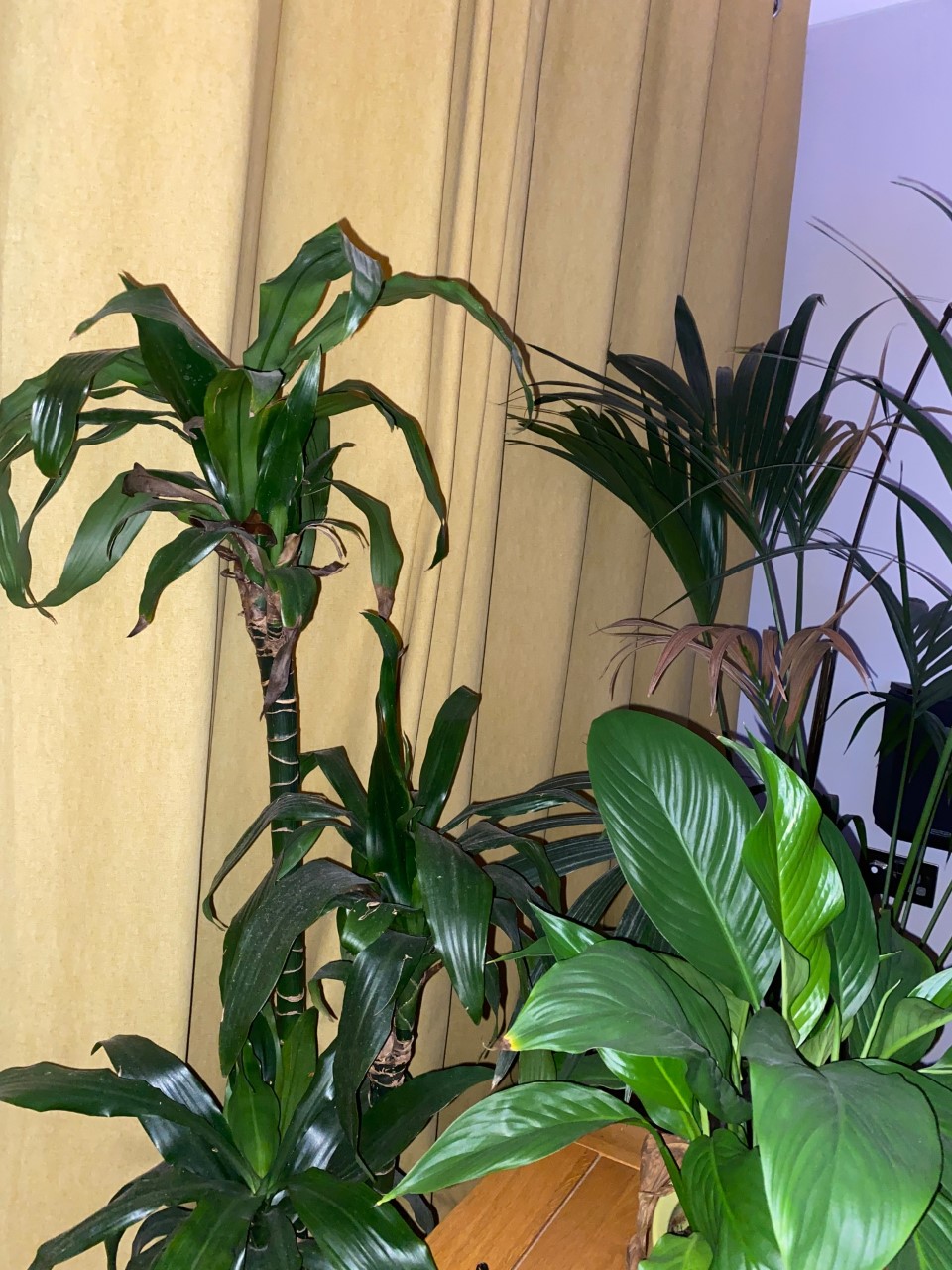
This part of the research I collected some reference and inspiration online and in real life that related to the themes in the book. I firstly took pictures of the trees in my house which are conveniently similar to those on a desert island and there are pictrues I took a few years ago of a fire which is good for the paperback, the way the fire is behaving and its shapes would make teh genuine cover more realistic . Online I looked for desert islands in general to see if there were any shapes and features I could replicate as being embossed on the hardback and if I could paint them in a style digitally for the paperback edition.


As for the typefaces I had a good look on Pinterest and made a nice folder full of ones I thought were appropriate. To find what I was looking for I typed in words like vintage, pirate, and old typefaces. Here’s a link to the folder I made.
https://www.pinterest.co.uk/epiceyebrows/old-typefaces/
A little bit of reference for binding and debossing/embossing
So before bringing the typeface and imager together I did thumbnail sketches for both edition cover and spines and why I included certain features and whether they relate to the story. I wanted to get the imagery down first and then try the typefaces over each design to see how they fit together and how the shapes and sizes reflect the design well.


I then moved over to my iPad to play around with my favourite ides and sketch them out again not focusing too much on the text other.

This first paper back design was the most generic designs as there was already a lot of editons that had very similar if not the same imagery such as this cover.I suppose I wanted to remain true too these version as they but part of me wanted to create a whole new version of my own that I hadnt seen before.


This design is one of my favourite and this too is inspired by one of the scenes in the book where Crusoe and his rescued Friday are watching the natives capturing and killing a captain adn crew. I liked the idea of surroundign the edges with foliage adn with my reference pictrues I could use for this drawing or real life pasted in. Friday Is featured on a lot of the sovers and he becomes crusoes partner so he is an appropiate charcter to have on the cover.

This design I immedialey knew I wanted to use, not only becasue this design of a fire and robinson crusoe and his dog I had not seen but The colours and tones I think would be the most eyecatching. Him sitting in his dark cave with this illuminating warm fire in the centre of the page revealing only parts of his face while the rest of him is in the shadow.

Lastly this again was another safe option, a portrait with the island or something happening in the background heavily inspired by another exisitng cover or two.

For the hardback however I wanted a nice simple design, cryptic and almost and had a look of a diary which represents robinsons own diary he kept.


These designs all have borders round cause I liked the neatness of them, I didnt want the cover to be too busy, a nice embossed island and handwritten year markings to symoblise Crusoes 28 years on the island.


Sticking with the simple theme my inspiration was these leather diaries I found online, the gold on brown. The gold related to the coins crusoe found on the shipwrecks and the brown for the nature around him.
I like the idea of the border or casing being stitched like these pocket books below too.


Out of the designs for the paperback I mocked up the design I liked the best, I would like it to be a lot cleaner than my drawing I have done but this is just to get the gist of the tones, shadows, light and the centrepiece. This design makes it easier to fit the writing around it. I used some typefaces already on the app (procreate) just to pencil in the composition of the text an image. I really liked how it turned out. I think If it was the real end finished product, I would need some more reference a long the lines of someone near a fire like Crusoe so I could work on the light hitting his face and the behaviour of the fire.


This typeface called Papyrus I think I do prefer just because of the rotted look of the letters, they’re rough and stone like which plays on the abandoned island and using nature for tools.

This was a contender for the hardback edition design however this text i thought was just a bit to big, I really think it matched the mood of the book and the cover but some of the letter like F and R's are just a bit too big. The name of this typeface was Zapfino.
Mocking up
So, using the app procreate I mocked up both edition designs as well as the case I would like to go along with the hardback.
This is the paperback, I still hadn’t yet decide what was going to be on the flaps and whether I would put the blurb or on the back of the back or on these flaps or put quotes from readers or from the book itself. The image as a whole is Crusoe on the front and then the design stretches over the spine onto the back where we can see all the supplies he had collected and the dog sleeping. The flaps I decided should just be black with white writing to fit the aesthetic of the fire in the cave.

The hardbacks design wasn’t a full spread like the paperback, because there’s no extra space (flaps) for writing the blurb fit best on the back and It felt empty so I handed some palm trees hanging in the top right corner and a little parrot Crusoe befriended on the island. For the spine I liked the idea of also making a border around the edges writing the title and author as well as adding a little logo of a sinking ship like those leather pocket books with symbols on as well as waves on the bottom like I tried during the thumbnail sketches. The cover text I wanted the R and C to be bigger than the rest because again it’s like when you see a diary with just initials, if I was only using R.C it would make it a little more personal looking like you’re about to read his diary.

Along with the book design was the case it would be places in where I could really make it like a diary with a latch and circular symbol in the middle and stitched border again inspired by my research. The text I used for this was called Hoefler Text in black italic.

Black case with brown book I think looks the smartest, I did like the brown case but I feel like the materials of the two browns would clash, the case would maybe be lighter or darker than the book I think the black contrast better.

Reference pictures for design

I expanded on these mock-ups one more time, made the designs a bit cleaner and added a few bits as well as chose the best typeface (from Pinterest). I am really happy with the outcomes of all of these, I pasted both onto a existing book, measures the sizes so it fit just right.
The writing for the blurb I used a font from Procreate because I carefully had to trace those title letters and it would have took so long or the writing would have been to bulky to read. As for the flaps for the paperback I just pasted some random paragraphs and quotes to fill the space but If it were really I think I’d get some reviews on one side, an example of the first edition and quotes for the author too.
These were the typefaces I decided to use:
For the paperback


Both of these are more or less what I really wanted. The pirate, old timey vintage feel. The big dramatic letters and also letters that have fading or gaps in to show age or it being worn down a bit, sets the tone of the book.


I tried out two ship symbols too see which looked more professional and while the first one of these ships stays on brand from the hardback spine, I do really like the second ship. It looks cleaner, but it also doesn’t showcase a 'shipwreck' like my original ship logo.
Here are the print out mock up covers pasted on the books I had in my house in which I measured to fit. here are the dimensions I printed them in

Paperback


Hardback


So, cutting, folding and sticking these prints over the cover I couldn't use glue or tape because I didn't want to ruin my books but I tried my best to replicate things like the cover folding over the inner edges on the hardback. I really liked how both turned out.

Overall, I think these designs follow the brief pretty well, I have made detailed mock ups, researched the size, paper stock, binding and paperweight and responded to certain qualities I was instructed to create such as "The pocket edition needs to celebrate the functionality of the book as a lightweight, transportable object, and to connect to the story’s travel or survival themes in a contemporary way". Also making sure the Deluxe hardback "presents the content in a larger, finer, more luxurious, considered or expanded way, that perhaps makes reference to the history of the book itself."
The only fall back of this assignment is that the designs themselves are appropriate for the story but they don’t have much connection to each other, I don’t think you can tell they're related only maybe by the black case for the deluxe with the gold writing which the paper back also displays but again I didn’t really bring the together. I think I didn't refer back to the brief as much as I should because I missed out that detail. With my sample inside pages I did try incorporate designs details from one another to try connect them, symbols like the ship.
In addition to the covers, I mocked up a few pages that would be inside the books. The paper back having the title page with the Viking press logo on the bottom and the ship symbol which I’ve used throughout all the designs and the hardback adding an illustration page as some do. The image I got was just off google as an example of a full body shot or a portrait of the main character, I think it fits well with the ‘deluxe’ as there’s a visual not just text. I did a contents page for both again. The typefaces were consistent with the front cover text. I pasted these example pages over the book to get the full feel of if the design were to be published. I looked through all my books and had a look at some of the pages and the pages all of them had were, titles, some illustrations and some had contents pages too.
Hardback


Paperback


Survival Guide
Tackling the side project, the survival guide Washed
Ashore: The ultimate guide to surviving on a desert island by Rik Bennett. I took
to my sketchbook to thumbnail some ideas, I firstly though of a helm floating
in the ocean or some sort of obvious shipwreck, an island in the middle of the
ocean and the use of wood chop offs to create part of the title as well as a
fire with supplies surrounding to relate to the survival methods and tools.

Straight away I knew I wanted to use the floating island and the wood planks for part of the title to replicate broken pieces of the ship. The other thumbnails dint feels any sparks with like the SOS because I don’t know how I would photograph or make that image realistic, and it isn’t really exciting. I kind of just went for it and on procreate on my iPad I found a picture of the ocean and sky and then pasted a procreate image of a desert island in the middle of the water and then found a wooden image and cut an pasted different shapes and lengths and then made them into the word SURVIVING.


I really loved how this worked, I used a distort tool which I could make it, so the perspective was flattened to look like it was floating on the water. Surrounding this surviving I put more pieces of wood around to again show the result of a shipwreck. I then tried out the rest of the title to see how it fit with the image id created, it felt a bit empty with just the wood so I then pasted some old cloths/fabric pieces amongst the floating planks to represent the sails being ruined and ripped too.
The typefaces, I went onto Pinterest again and had a look for some bold and important looking letters, traced and set them out using black and white. The white text at the bottom looks good on the blue but after I added extra wreckage the black with white highlights looked stronger. After being satisfied with my design and text I showed my dad who said ‘why don’t you see what one of those safety rubber rings look like floating by’ and I had to try it. I did end up using that idea for the final product not only on the front page but in the corner of the back page which is just some waves coming up onto the sand and black text in the centre.
The bright beachy colours make it light-hearted and the quirky but informative text match the tone. I did try fading the colours to make it old lookign to match the vibe of the Crusuoe editions. The survival guide turned out to be quite modern looking instead, I think having it modern would get picked up in the shop because of its brightness and strong design. To relate it to Robinson Crusoe he got a mention in the first sentence of the blurb which was a question which helps draw the reader in. “Ever wanted to life the life of Robinson Crusoe?”. Finally the spine I used the same text and planks of wood to fill the whole length. I think it looks cool, it’s a nice transition between the front and the back. I did decide to keep the author in the colour.


Using a small handheld book, I had I digitally pasted my designs over the top this time around rather than print. I think it encapsulates the survival concept, keeps it light-hearted with the colours and blurb. A life ring, desert island, evidence of a a shipwreck and the never-ending ocean.
Relfection
Reflect on your outcomes but more so on your creative process - what worked for you, and how might you adapt these approaches for future projects?
The outcomes of these designs I am happy with, I think I successfully followed the brief, and these designs reflect the story of Robinson Crusoe, all the way down to the materials, colours, paper stock and white and binding. The only mistake I made was not having a strong enough connection between the hardback and paperback other than symbols.
The survival guide I took a modern approach which works well with the subject being so heavy, it creates more intrigue into a serious topic with a Whitty bright blurb and imagery. The thing with this guide was I didnt have to experiment with many of the sketches becasue I had an idea in my head as soon as I seen the brief, the wood floating as the letters and a lonely island were all I seen. I do think this turned out well because there wasnt much overthinking.
A thing that worked well was definitely using thumbnail sketches and my iPad to also sketch out these ideas, mind maps were also a big part of my planning and getting all the information and research was quite necessary for every element of the books not just the designs. I will be using all these tools in the future as they do help with forming ideas.


.png)
Comments
Post a Comment