Text, Image and Typography Part 3: Assignment 3 My little book of...
Firstly, I picked out what I needed to include from the brief and messily wrote them all down in notepad before taking to my sketchbook to sort the contents of the pages into categories.

In my notepad I also wrote the general gist of the sentences and use of definitions, so I could just paste them straight onto my digital pages and rearrange them after. Having just the writing at first was overwhelming because I didn’t have a visual page to decide the composition. But I did draw a flat plan out to help with that.

Then moving over to digital I just pasted the text on each of the pages, paying no attention to layouts, typefaces, images.
I started with the two front and back cover designs first before worrying about the inside. I didn't have much of an idea until I experimented with the layouts, they were both quite randomly created. I did have a think and look for inspiration from artists I researched but my designs turned out pretty original.
With the Good typography booklet, I had two versions, I used shapes to angle my text and used a grid to organise and neaten everything up. The first version (orange) turned out a bit too wacky for what I imagined. Having the backwards text and the chaos of repeating words and change in typeface I tried again.

The next version I used the power of symmetry, drawing a geometrical shape and duplicating it and flipping it so it all symmetrically overlapped. Then adding some texts along the shapes, I organised the title on different parts of the design not just sitting on the top all together. I also used some repeat 'good typography' in the centre in a spiral just to fill the space and give another focal point. As for the back I kept simple and the same colours and same text for consistency.

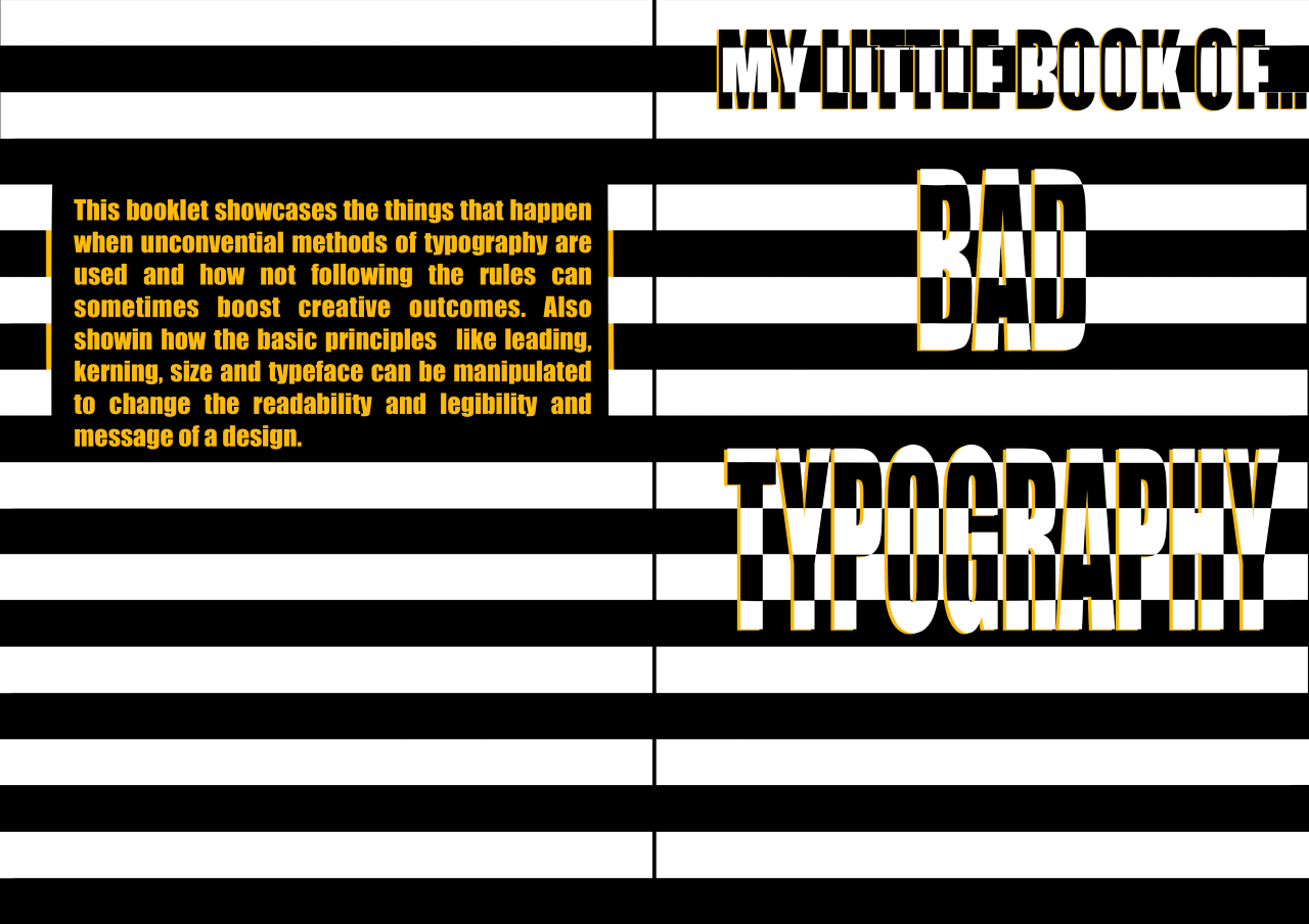
I also designed the bad typography cover after this too so I could then play around with the colours inside the booklet.

I wanted this cover to be particularly harsh on the eyes which I think achieved, I started with the stripes and thinking of an ugly idea to use with the title and the text weaving and contrasting with each other came to mind. It had to stand out and adding a little pop of yellow just makes it a little more readable.
So here are the booklets all together before being printed.
My little book of ... GOOD TYPOGRAPHY
Pg 1 and 2 - Explore the Principles of typography, Readability and legibility.
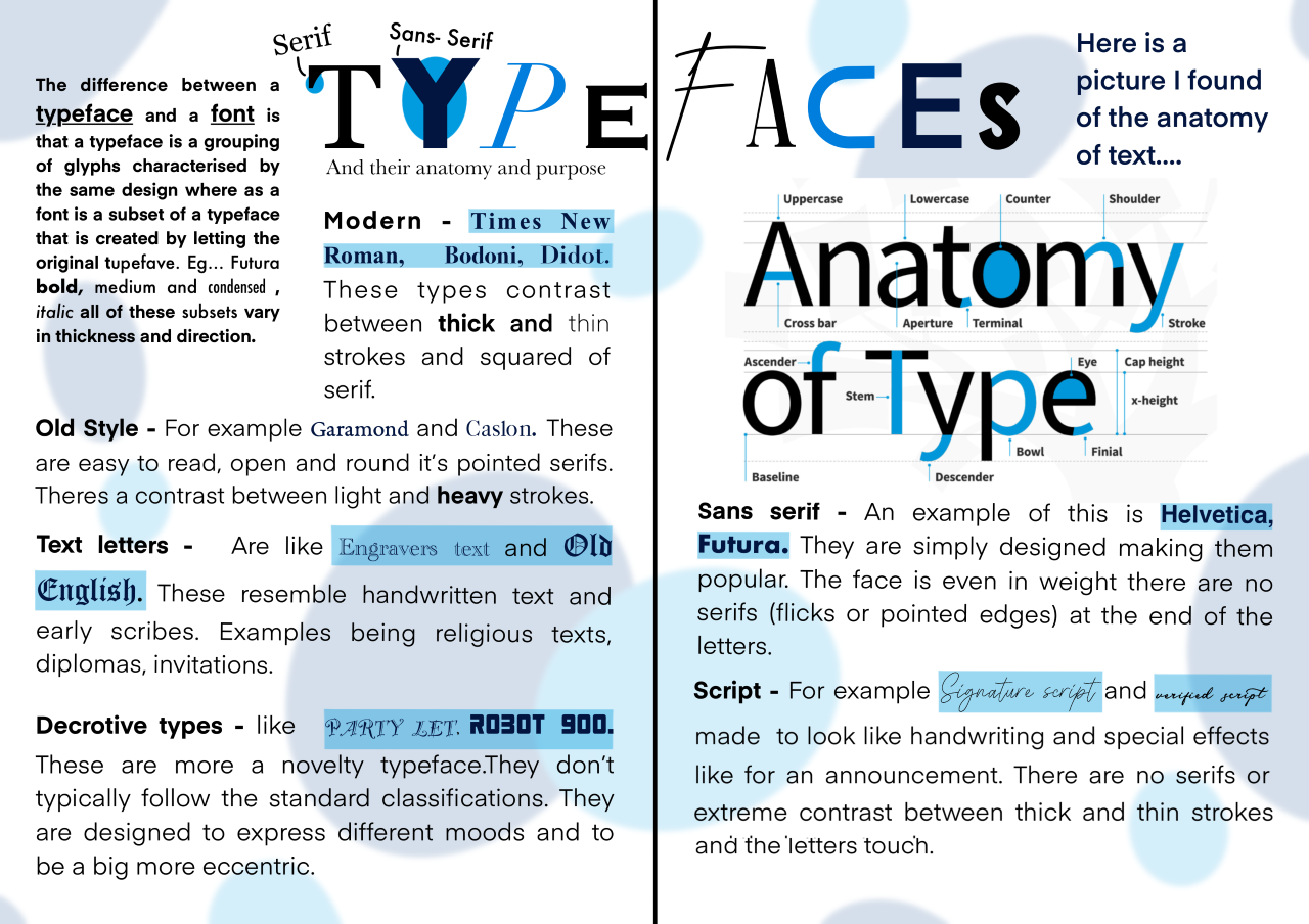
Pg 3 and 4 - The purpose of Typefaces, what they and their characteristics/Anatomy
Pg5 and 6 -The use of Grids and the Golden ratio in design
Pg 7 and 8 - Quotes from Artists/designers that typically use Good typography practices and/or how they approach a design.


This booklet I made purposely to be neat, measured and precise, the layouts are all aesthetically pleasing. The colour choices and backgrounds I made not to intense, so they fill the empty space but not be too loud.
My little book of ... BAD TYPOGRAPHY
Pg 1 and 2 - What constitutes Bad typography? and examples of this
Pg 3 and 4 - Not using a grid or golden ratio in designs and experimentation
Pg 5 and 6 - Artist/Designers quotes who work unconventional and their approach
Pg 7 and 8 - What bad typography means to me and examples of expressive typography.


This booklet I purposely tried to make a bit more Loud and ugly, I also made sure the text was still readable. Some parts may be a bit to wacky but I think the collage and messiness of it really fits with the theme.
I will also be printing and physically making both booklets too, I haven't decided how I'm going to bind them.
Here are the printed copies which I used super glue to stick all the pages together to replicate adhesive type binding, I wanted a clean and connected set of pages, Using just folds has done this. (bad typography on the top, Good typography on the bottom)


.png)
Comments
Post a Comment