Part 3 Exercise 6: Viewpoint
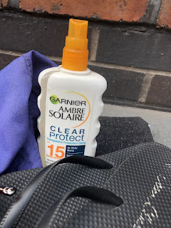
Here are my photos for the theme summer, I collected a pair of sunglasses, flip flops, sun cream, a bucket hat and a towel.
I made sure to capture the a few angles, different textures, and materials far away and up close. It was tricky trying to clearly show all the objects when zoomed in. However, I think I manoeuvred most of my angles to pick up the smaller details as well as the objects themselves.
Which viewpoint best fitted the word your objects illustrated? Why was this?
I like the composition of this picture, it’s so simple and centred yet it is taken upside down. All the objects can be seen, and the towel is not only part of the collection but acts as a background for the other items. This bird’s eye view I suppose could be the angle of what the sun sees, these things could belong someone has come to the beach with the necessities usually associated with summertime in general. This was taken in the sunlight which is lucky for capturing the theme. It’s also quite naturally arranged nothings perfectly propped but there is plenty of space to make out what everything is.
Which format best illustrated your words?
The rectangular one was easily the clearest image; all the objects were in view. It is kind of in the shape of a towel as the frame and the shape also is quite bold to contain the tones of the drawing. I think a rectangle is very practical, it can relate to all the objects how they’re the most practical for the summertime. On the other hand, I like the uneven rectangle as it’s a bit more creative and contains a lot more of the objects. Its openness makes it a bit brighter therefore depicts the behaviour of sunshine.
Did changing viewpoints make you think differently about your choice of objects and arrangement of them?
Changing the viewpoints made me think about how close I positioned everything with each other to fit in to one picture. The choice of objects were obvious to recognise besides the bucket hat, the way it sits doesn’t really prove what it is. Nevertheless, there were plenty of textures and features associated with summertime for example the pile of the towel, the stitching of the hat the ridges of the flip flops abs the lens of a pair of glasses, Where the full items couldn’t be seen I made up for in textures and when they were all in view the shapes/lines communicated the theme.
My visual my drawing illustrated the theme summertime, most of the items are recognisable. The sun cream bottle I did struggle with the perspective as I took it from a birdseye angle I couldnt figure out the shape and the proportion.I am happy with how it did actually turn out its quite a clean design not to much overlap or detail. Using a viewpoint I accidently undermeasures a line or two so it isnt the exact match of the orignal thumbnail but it is quite proportionate as I fit everything in the same way.


Comments
Post a Comment