Part 4 Assignment 4: Magazine Illustration KS
For this assignment I chose the word lost, I of course brainstormed possible associations with the other words but I just thought lost I could expand on a bit more. I normally go for a walk in the park most days and I have always liked the positioning of the signs by the horse-riding centre hence the horse on the sign. I thought using this environment would be the perfect for the word LOST.
brainstorm here >
There was another sign on the walk I didn’t want to be left out, so I pasted it on this image filling the space in between the two poles. I like that this gave another colour to the image it and now more text and messaging could be added.
On the blue sign, I added some wording in a similar text to the original relating to being lost and an element of humour and questions to read for an audience. When the positions and words were established, I then manipulated them and used effects digitally.
I wanted to create a sense of disorientation a more psychedelic take on the word lost. When playing around with different concepts I still made sure the text was always readable and the image wasn’t to warped to the point of the signs being unrecognisable.
OBSERVATIONAL DRAWING
From all my variations and the original I created visuals where I changed up the composition of the image and used various backgrounds of paths and shades and lines Following the warped theme and taking inspiration from a previous exercise, I created a collage using similar colours and added a road with a car and a few more signs to promote chaos within the picture. This abstract style was inspired by a couple of small canvases I did where the challenge was me and a friend had 10 minutes to draw something and swap with each other and add to their canvas before swapping after another five minutes and then 1 minute until it was time to repeat but with paint this time. These were the results. As you can see, they are vibrant in colour and strangely shaped. Because I am a lot more confident than my friend was with paint, I tried to added tones, shades, and cleaner lines and nice blends of colour where she didn’t. They turned out well. I wanted this final magazine illustration to have a similar warped weird effect with the intensity of colour. Doing fun challenges like this is great experience when you lack inspiration and getting used to blending colours quickly and keeping the brush fluid it came in handy doing this final piece. The only downside recreating this style is that the paper didn’t react as well to the acrylic paint as the canvas did. Nevertheless, the essence remained the colours where a lot closer to the original picture I took.
After sketching out all these versions observation and collage compostitions I
stripped the detail down so I could get the main shapes and lines and
so it would be easier when I applied the paint.
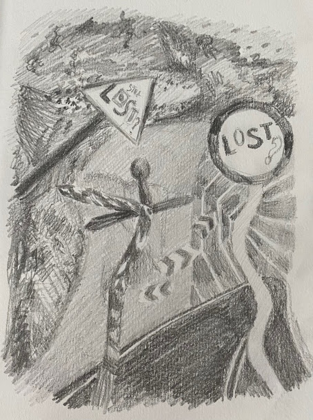
This is a tonal version of my chosen collage composition, I tried to avoid using distinct lines and focused just on creating shadows and relying on the use of tones to showcase each part in the picture. I sued a mixture of pencils ranging from H for the softer tones and 3b for the darker and then the rubber to define things like the post and creases or lines of the road.
In the collage there is a car on the road, but I didn’t really want to put a character in because I wanted the audience to be able to interpret the image themselves and focus on the message and the text. The psychedelic style and fluid shapes makes the image disorientated which fits with the theme of lost nicely.
After the initial sketch the first colours I put down were on the background, I only used one brush for the whole thing because it was the perfect shape for thick and thin. My technique was to build up the colour and have the brush stroke visible because I like the effect it gives, the subtle blend between each texture keeps it fluid but remain separate elements. Once the darker colours were applied, I added the lighter tones which brought the image to life, the outcome it lost its flatness. I didn’t want to much detail in this besides the text so the collage pages like the road and trees and wooden parts aren’t as obvious unless you knew. You can see the road clear enough it’s kind of more of an abstract environment made up of random textures but reflective of the original colours and such. As a final addition I also used a brush fine liner and white pen to clean up lines and around the text just to make the colours pop a bit more and so I could add the white writing on the blue signpost.


Comments
Post a Comment