Part 5 Exercise 5: Packaging
Researching for this I went to a supermarket to look for some packaging, I looked for more child orientated looking packaging. I looked at the colours, text, characters, and other attractive elements.
I found the colours used often reflected the flavours. For chocolate brown was the most used colour, for ginger flavour was orange as ginger is of a similar colour and finally raisin was purple. Taking theses factors into account those were the colours I planned to use.
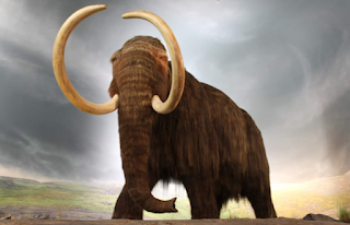
In the planning stages I jotted down some ideas of extinct animals an compared their qualities of lifestyles or appearance to the flavour and if they’d suit that flavour.

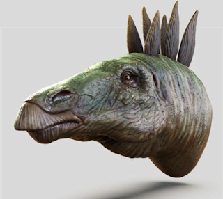
I researched pester power and what things might attract kids. The cartoon characters and yummy looking biscuits as well as the bright colours. Initially I was going to do a dodo bird for the raisin flavour because that was more relatable to their diet after choosing well known animals such as a mammoth and sabretooth tiger thought I couldn’t leave a popular animal such as a dinosaur out. Stegosaurus I used as kids often know the name of that one and the raisin flavour also kind of fits in with them being an herbivore. The mammoth was used for chocolate chip simply because of its colour. The sabretooth tiger I sued for ginger not only for the colour but the cracks in the biscuits when they’ve been baked resemble stripes on a sabretooth.
For reference I googled some images because there extinct
there wasn’t any physically references to use. Because I wanted to have them be
cartoons, I put a spin on the realistic pictures I seen. The sabretooth tiger I found to be quite difficult to look friendly
until I remembered the film Ice age had a cartoon sabretooth tiger, so his body
shape was a heavy influence (big paws and big eyebrows) In addition to making
these characters I also gave them personalities. The mammoth with a powerful
stance but happy expression, the sabretooth tiger having a ginger biscuit in
its mouth to promote mischief and cheeky side glance to the biscuit her ate a
chunk out of and finally the stegosaurus is trying so hard to reach the
cookies, its standing on it hind legs. It also has raisin humps instead of its
typical ones which just makes it a bit more fun. But these little sketches/visuals I dotted some colour and played around with the characters before moving over to digital.


As soon as I sketched in the characters the composition fell into place. The background for the choc chip mammoth box I had an idea straight away that it would resemble cracking Ice and the same for the biscuits, they to I wanted to bits to be breaking off. I think the effect I wanted to create was that a mammoth Is huge therefore the ground beneath could crack due to the vibrations of its steps. It also reflects the ice age. The other two were created purely from sketching and moving things around the page such as plants. Shapes and patterns. This first sketch I just kept the logo in the left corner for the time being so I could do the whole design and then fit it in.


With ice in mind for the Choc chip flavour and the crumbling of walls as cookies this was the compostions and colour choices I would use. As for the shadow uner the mammoth I ended up getting rid of that becasue I hadnt included a ground for it to be on I wanted it to be floating in away as to not take up more space.

The raisin flavour I wanted a few plants and for the background to stand out in a way that wasn’t too powerful but make the picture busy. I took inspiration from biscuits in real life such as the Victoria biscuits that has a faded background were the edges were darker compares to the middle, I think it draws the attention into the middle which was good for my stegosaurus. They are waves that were a later add as the background wasn’t as busy, I thought it would be. I think it just breaks up the image a little more and introduces new tones of colour.

Inspiration for raisin background.... the faded into darkness effect.


The ginger flavour I took inspiration for many packaging that had solid colours at the top or bottom, so this version just had red all over and it looked quite empty until I eventually used blue waved shapes. I followed a boxier design for the background broken by the blue. I think having a variety of designs between the flavours means there’s more of an incentive to buy all the flavours because they’re all slightly different, it would be like collecting. Like the raising flavour the background looked a bit plain so as a alter addition I though different sized dots fit nicely with the biscuits in the foreground. I made many changes to all these designs, not big ones but little features that brought the illustrations more to life and filled the spaces evenly.
These are the finished packages, instead of doing 1 I did all three becasue I wanted to see the series all together.


Mixing Cartoon with realism
I wanted to bring elements of realism to the packaging by using pictures of the actual biscuits. I found appetising pictures and pasted them and manipulated them into parts and corners and all over the boxes. The choc chip flavour I gathered them either side and broke off little arts to present that crumbing effect I wanted. I also changed the contrast a little to make the colours pop and used the same colour for the mammoth as the chocolate chips.
The raisin I did the same for the biscuits except I had to try capture a health looking raisin cause a lot of the raisins I seen pictures of didn’t look to appealing. But I managed to change the colours around as well as the ones used on the dinosaurs back. The composition was purely random and fit around the character in the middle and where the empty spaces should be filled.
The ginger was easy to find biscuit pictures for, I found freshly backed and just changed the angles and size of them and again dotted the m around where I felt looked best. There are clusters of the biscuits in this one. There’s no reason for this other the wanting to change it up.
Biscuits/cookies I used


The colours
The colours were important for these biscuits because they had to look appetising to eat, luckily, I found healthy looking biscuits with good colouring and lighting. Its good to see the biscuits on the box sometimes because you know what you will be getting inside. Throughout the designs I wanted to make sure the illustration had layers and dimension, the use pf shadows emphasis all the element and things overlapping and hiding under things also makes the image busier and more interesting. The positioning and shadows really effect the realism of biscuits such as looking like the ginger biscuits and raisin are falling at different distances and spaces. There is a sense randomness but also, they are positioned in a way that ties everything together and keeps from there being weird looking spaces.
The Text
For the words ‘Organic’ and ‘biscuits’ I kept the all the same for all, the only differences were the angles because I fit them around the main titles which all differed. I chose to use the font Bodoni 72 in italics because I like the professional style, it is a bit of a theme on some organic biscuits for kids I researched that the word organic was angled diagonally, or the letters weren’t in a straight line or if they were they were slanted. I think it looks a bit more trusting if organic is neatly written which is the reason, I used a digital font. As for the colours of this digital font I used contrasting ones, so they were clear. The main titles however I handwrite all of them. Immediately for the raisin flavour stones came to mine and like rocks in fossilised writing. I also tried to use alliteration for these to make them more eye-catching and the words used would relate to the illustration ‘roaring raisin’ for a dinosaur. ‘Cracking Choc-Chip’ for the cracking ice and biscuits. as for the style of writing I used ice age once again for inspiration, the titles for them are big blockily letter with tinning edged to the letters. I also angled them upwards brown against the bought blue as a nice contrast
But I struggled a lot with G, there was no exciting word to use, the only word came to mind were greedy or great and neither of them I felt fit the theme. So, I had to use another word not of the same letter and I landed upon mighty. I think this is a lot more relatable to the tiger character as you think of them as being feisty and powerful.
At the bottom just for reference I found some nutritional labels that may be realistic and changed the colour to fit each design.
and these are some of the organic food items I found as well as similar layouts and compostions to mine like the wave of colours at the top or bottom, the afding into darkness and mixing real life food with cartoons.

The Logo
The logo I created was just an example to place on the box hence my second name ‘brownes’. I found some bubble writing on most biscuit boxes and packaging and thought I wanted a more fun and cartoony type. The colours I chose depending on what I used for each flavour. The intial design was yellow black and white but I either used colours that contrast nicely or looks aesthetically pleasing or matched the same colour somewhere else on the box. Then I placed them all in different places on each box just to see how it affected the overall illustrations and to work around it is using a big title.


Finally, along with the text was the shapes and
background for them to be placed on, they were quite spontaneous and really,
I think I decided to use them to fill the space, I did want an angled shape for
the raisin flavour I think so it pointed towards the main character in the centre.
The choc chip didn’t really need anymore space filled so I just placed the brown
text on the blue background and for the ginger I though it looked cool to have
a tooth of a sabretooth tiger. I suppose constant shapes and text would also look good for the series becasue it might make it more obvious that they are all from the same brand. But my cartooms and the realsitic layout as well as the logo might be enough.


.png)
Comments
Post a Comment