Sketchbook as Object part 2: Research 2.5 - Christoph Niemann & Saul Steinberg
Christoph Neimann
Christoph Neimann who was born in 1970 In Germany is an artist, graphic designer, author, and animator whose work has been featured on the cover of The New Yorker, National Geographic and The New York times magazine. As well as being showcased in places like museums. His style is quite versatile as he uses a lot of styles and techniques ranging from digital creations to animations to watercolour to printing. His work is often very light-hearted and fun or quirky.


His work is relatable in the sense I also draw strange things or creatures out of other things, so I enjoy all of the different styles and random Ideas he’s done and how adaptive he is. These are 2 of my favourite pieces form his website.

The mad colours are my favourite part of this, its such a loud picture with so much to look at.

I like how the character protrudes out from the photo and the use of the bike tires as hands and steps as an arm.
Saul Steinberg
Saul Steinberg 1944-1999 was a Romanian American artist who was very influential for American art. 'Influenced by Dada, Surrealism, Cubism, and Pop, Steinberg’s varied output reflects the defiant humor, curiosity, and modernist attitude of an artist trying to make sense of the chaotic postwar period.' ‘While renowned for the covers and drawings that appeared in The New Yorker for nearly six decades, he was equally acclaimed for the drawings, paintings, prints, collages, and sculptures he exhibited internationally in galleries and museums.’
Looking through all of his work his style is quite fun, he too like Christoph has a playful style with a lot of personality whilst sometimes being quite political or serious. Steinberg being born before the wars I can imagine that all he would have access too was paper and pen or pencil hence why his work is done traditionally. His sketches are kind of like doodles or quick handed drawings. His work is quite cute it reminds me of the characters you’d see in a children’s book. However, his work was a lot more than simple sketches they range from abstract to quite detailed when drew things like cities or his environment some covering a whole page or used as a mural.


He did also showcases a variation in his style like for
example this one of Cincinnati where he uses quite geometrical shapes and lines
for the buildings and landmarks that are all connected through the lines. He
uses a mixture of detail and linework and subtle colours. In comparison to
something abstract like this one (rainbow image). What is intriguing with his
work is how he always includes an element of abstract or a pop of colour.


Here are 2 of my favourites from his website.


Another style Saul explored was one quite similar to Christoph Niemann, he too made characters and concepts out of random objects or everyday surroundings. Examples of his


Untitled 1950.
Differences and Similarities
Both
artists are so imaginative in what they come up with. Their ideas are always
quite fun and come out of things you wouldn’t see yourself naturally. While
stylistically each have similar traits Saul's theme of work sometimes has a
deeper meaning, I think this is due to the experiences he would have lived
through during the Wars eventually leading him to flee to America. Whilst Christoph’s
perspective of the world would be a lot less political and serious therefore his
work being a lot more light-hearted and simpler.
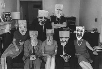
An example of this is the hidden meaning behind Saul’s like you can see in this series of ‘paper bag masks’ done Between 1959 and 1963. He drew faces on paper bags and photographed people wearing them. It says it represents the ‘world as he saw it, everyone wears a mask, whether real or metaphorical. People invent personas through makeup, facial expression, hairstyles, and these facades become who they are. “The mask,” Steinberg wrote, “is a protection against revelation.”’
Then comparing the simplicity of Christoph’s series ‘Sunday sketches’ where he just draws on the world around him making characters or giving objects personalities. The isn’t much meaning behind his drawings they seem to just be from his own imagination rather then representing something deeper. He says “When I work on my Sunday Sketches, it’s never about a sudden inspired spark. I pick a random object, and then I just stare at it. I look at it from different angles, play with the light (usually just by moving my desk lamp). And I try to open my mind as wide as possible, to see if a peculiar angle reminds me of a familiar shape.


others....


Another difference is the style of how they draw cartoons and doodle. Saul being older only used traditional media and his drawings are quite tightly packed and although some appear detailed the proportions of things are minimalistic, there’s no perfect realism. I think his style revolved more around just putting it down on the page not worrying to much about accuracy leaving drawings looking ‘unfinished’. Although looking closely there isn’t much mess, his line work is quite clean like he knows what shapes and direction to draw in. In comparison Christoph’s drawings are lot more modern and high quality (likely because of technology), he produces digital art as well as watercolour and ink to do his sketches rather than a biro or pencil on paper. His doodles aren’t always as intricate as Saul’s and sometimes his lines aren’t just one size, they thicken and thin like its quick brush strokes instead of steady lines at in gives a bit of depth to a simple drawing.


Sauls ^


Christophs ^
There main
similarity is the ‘making things into other things’ series, they are just done in different timelines where different objects and environments are beings
used. Also Sauls has a lot more building orientated photographs with no characters and making cities out of objects but Christoph usually focuses on making the buildings themselves or objects as part of the character.


.png)
Comments
Post a Comment