Sequence and Narrative part 4: Fill it up FAST! 4.0
I went to the Walker Art Gallery where there are a a mixture of fine art, sculptors, vitange items adn clothes, furniture and dishes or cutlery adn modern art to. There was a tudor exhibiton on but unfortunatley it wasn't free. Sadly I did'nt manage to catch any living figure about it was weirdly so empty even though town was packed in the centre. Neve the less Istill had 3d statues to observe. For my sketchbook I found little 26 page note pads and thought it was a perfect amount and it meant I didnt have to worry about making my own and having it fall apart. I will make my own somewhere thoughout this part.


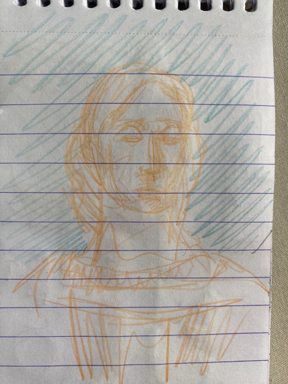


This as well as 3 others I tried my best to fill the page as much as I could describing what was happening and mixing different artworks to make it like a drawing collage. I feel like I should have done more pages this full its a shame I left a lot of empty space on some. My favourite room was the one with the statues in cause the room is full of them and they're all amazing to look at up close. I used the word elegant somewhere cause thats exactly what that room was.
As for my toolkit I decided to add a few more things to my pouch, colour was one of the main editions. I had coloured pencils, 3 mechanical pencils 0.7 and 0.5 , putty rubber, regular rubber, white pen (didn't use) A biro, fine liners and a thin black marker. I like these chosen tools for now but i may branch into the messier mediums in future exercises like charcaol.

Did you use any new media approaches?
I did use multiple medias I used coloured pencils, fine liners, thin marker, a biro and a regular mechanical pencil. I switched through all the media's randomly when starting on a new page. In reflection I think I should keep using colour because I do like the different effects it can create, I can change the moods through the use of colours and the original object. I don't use much colour often because it takes longer than just using regular pencil or pen, but this exercise has inspired me to test out the waters. I may add some bolder colours or pens in the future.
What did you discover about working fast on the same theme?
Because it was all the same thing, I could be spontaneous with the media because there were no completely different subjects of art as all of them were created around similar times. If the styles were opposites, I think some medias could fit more than others like traditional being pencil and pen whereas modern art being full of colour or simpler. There was plenty to draw all around me in each of the rooms; I could draw one thing after another especially in the statue room. Depending on the complexity of the artwork I often favourite the pencil for the more detailed pieces with thinner or bolder lines whereas the colour came out often quite soft and sometimes hard to see. The colours being soft sometimes did match the softness of the statues and expressions which was nice.
Did you get done as much as you expected to?
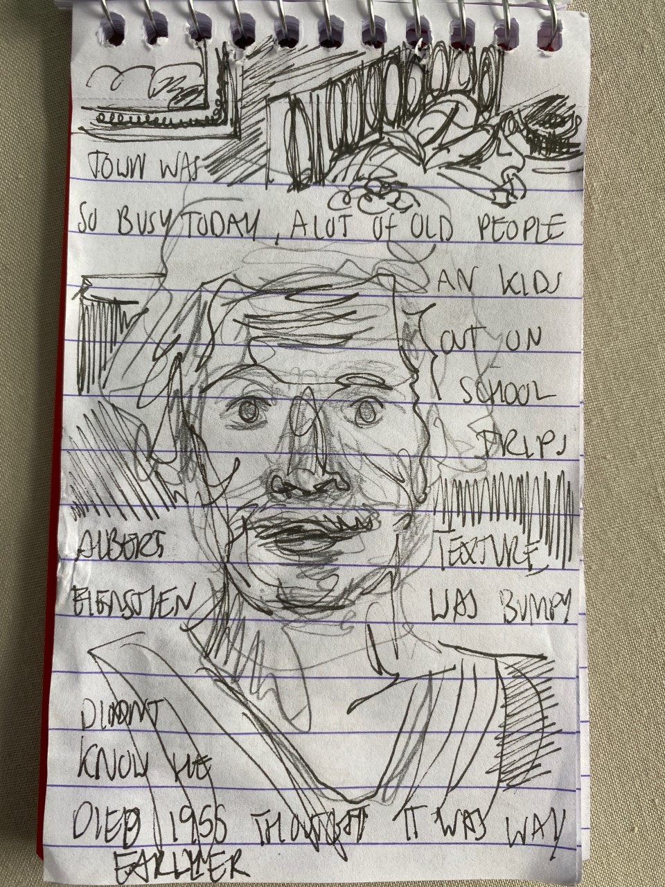
yes I know, there was plenty to draw but trying to be quick wasn't always how it happened cause I wanted to at least get the shapes of things right so I knew what I was drawing when I came back to. Turning the page and holding all the different pens pencils in my hand was a bit annoying because it was awkward to switch fast I felt like I was juggling. I did end up with around 26 pages which I didn't think I'll be able to do. looking through the pages I do wish I can combined different drawings paintings and statues on the same page as there is a lot of pages where there is just a single object and it looks a bit empty. I also feel like I could have spent more time there maybe with a few more pages as there were so many things around me to choose from. My favourite room being the statue room with so many figures in different positions.
Would you try this in a different environment or at a different time?
I was surprised in the gallery because the city centre was packed but there weren't many people in the gallery like there was previous times I've been. I feel if I have gone on the weekend, it would have been a lot busier. Do it a few school kids out on a school trip around the museum and the odd older person for every time I entered a new room it was just me there. Maybe other locations such as the Museum of the city centre a restaurant or food court be good at capturing figures, there are also many different characters about and I may have had more real life moving people to observe rather than mostly just the statues people paintings.
Things to consider
· Carrying a small notebook/sketchbook and toolkit with me on outings.
· Take more time observing
· Use moving figures to draw
· Try an fill as much as the pages as possible maybe even add some writing
· Test out different places
· Don’t worry about accuracy
· Use more mediums
· Pick different days where the weather may be different.
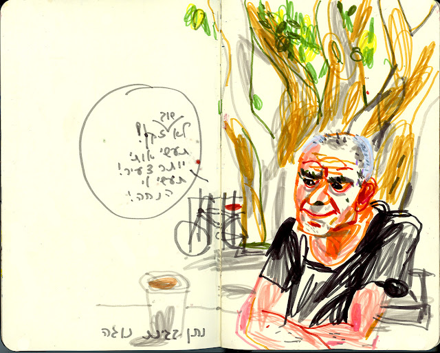
vjIn addition to this drawing I also had a look at Marina Grechanik’s sketch diaries
https://marinagrechanik.blogspot.com/ - Her Blog


D
In
i
I


.png)
Comments
Post a Comment